Showing posts with label software. Show all posts

Tuesday, April 26, 2016

Statistical software should remove *** notation for statistical significance

Now that the emotional storm following the American Statistical Association's statement on p-values is slowing down (is it? was there even a storm outside of the statistics area?), let's think about a practical issue. One that greatly influences data analysis in most fields: statistical software. Statistical software influences which methods are used and how they are reported. Software companies thus affect entire disciplines and how they progress and communicate.
Star notation for p-value thresholds in statistical software

No matter whether your field uses SAS, SPSS (now IBM), STATA, or another statistical software package, you're likely to have seen the star notation (this isn't about hotel ratings). One star (*) means p-value<0.05, two stars (**) mean p-value<0.01, and three stars (***) mean p-value<0.001.

According to the ASA statement, p-values are not the source of the problem, but rather their discretization. The ASA recommends:

"P-values, when used, would be reported as values, rather than inequalities (p = .0168, rather than p < 0.05). Indeed, we envision there being better recognition that measurement of the strength of evidence really is continuous, rather than discrete."
This statement is a strong signal to the statistical software companies: continuing to use the star notation, even if your users are addicted to them, is in violation of the ASA recommendation. Will we be seeing any change soon?


Wednesday, April 02, 2014

Parallel coordinate plot in Tableau: a workaround

The parallel coordinate plot is useful for visualizing multivariate data in a dis-aggregated way, where we have multiple numerical measurements for each record. A scatter plot displays two measurements for each record by using the two axes. A parallel coordinate plot can display many measurements for each record, by using many (parallel) axes - one for each measurement.

Monday, April 25, 2011

Google Spreadsheets for teaching probability?

In business schools it is common to teach statistics courses using Microsoft Excel, due to its wide accessibility and the familiarity of business students with the software. There is a large debate regarding this practice, but at this point the reality is clear: the figure that I am familiar with is about 50% of basic stat courses in b-schools use Excel and 50% use statistical software such as Minitab or JMP.

Another trend is moving from offline software to "cloud computing" -- Software such as www.statcrunch.com offer basic stat functions in an online, collaborative, social-networky style.

Following the popularity of spreadsheet software and the cloud trend, I asked myself whether the free Google Spreadsheets can actually do the job. This is part of my endeavors to find free (or at least widely accessible) software for teaching basic concepts. While Google Spreadsheets does have quite an extensive function list, I discovered that its current computing is very limited. For example, computing binomial probabilities using the function BINOMDIST is limited to a sample size of about 130 (I did report this problem). Similarly, HYPGEOMDIST results in overflow errors for reasonably small sample and population sizes.


From the old days when we used to compute binomial probabilities manually, I am guessing that whoever programmed these functions forgot to use the tricks that avoid computing high factorials in n-choose-k type calculations...


Thursday, May 20, 2010

Google's new prediction API

I just learned of the new Prediction API by Google -- in brief, you upload a training set with up to 1 million records and let Google's engine build an algorithm trained on the data. Then, upload a new dataset for prediction, and Google will apply the learned algorithm to score those data.

On the user's side, this is a total blackbox since you have no idea what algorithms are used and which is chosen (probably an ensemble). The predictions can therefore be used for utility (accurate predictions). For researchers, this is a great tool for getting a predictive accuracy benchmark. I foresee future data mining students uploading their data to the Google Prediction API to see how well they could potentially do by mining the data themselves!

From Google's perspective this API presents a terrific opportunity to improve their own algorithms on a wide set of data.

Someone mentioned that there are interesting bits in the FAQ. I like their answer to how accurate are the predictions? which is "more data and cleaner data always triumphs over clever algorithms".

Right now the service is free (if you get an invitation), but it looks like it will eventually be a paid service. Hopefully they will have an "academic version"!

Wednesday, May 12, 2010

SAS On Demand Take 3: Success!

I am following up on two earlier posts regarding using SAS On Demand for Academics. The version of EM has been upgraded to 6.1, which means that I am now able to upload and reach non-SAS files on the SAS Server - hurray!

The process is quite cumbersome, and I do thank my SAS programming memory from a decade ago. Here's a description for those instructors who want to check it out (it took me quite a while to piece all the different parts and figure out the right code):
  1. Find the directory path for your course on the SAS server. Login into SODA (https://support.sas.com/ctx3/sodareg/user.html). Near the appropriate course that you registered, click on the "info" link. Scroll down to the line starting with "filename sample" and you'll find the directory path.
  2. Upload the file of interest to the SAS server via FTP. Note that you can upload txt and csv files but not xls or xlsx files. The hostname is sascloudftp.sas.com . You will also need your username and password. Upload your file to the path that you found in #1.
  3. To read the file in SAS SODA EM, start a new project. When you click on its name (top left), you should be able to see "Project Start Code" in the left side-bar. Click on the ...
  4. Now enter the SAS code to run for this project. The following code will allow you to access your data. The trick is both to read the file and to put it into a SAS Library where you will be able to reach it for modeling. Let's assume that you uploaded the file sample.csv:
libname mylibrary '/courses/.../'; THIS IS YOUR PATH
    filename myfile '/courses/.../sample.csv'; USE THE SAME PATH
      data mydata;
        infile myfile DLM='2C0D'x firstobs=2 missover;
          input x1 x2 x3 ...;
            run;
              data mylibrary.mydata;
                set mydata;
                  run;
                  The options in the infile line will make sure that a CSV file is read correctly (commas and the carriage return at the end of the line! tricky!)

                  You can replace all the names that start with "my" with your favorite names.

                  Note that only instructors can upload data to the SAS server, not students. Also, if you plan to share data with your students, you might want to set them as read only.

                  5. The last step is to create a new datasource. Choose SAS Table and find the new library that you created (called "mylibrary"). Double-click on it to see the file ("myfile") and choose it. You can now drag the new datasource to the diagram.

                  Wednesday, January 27, 2010

                  Drag-and-drop data mining software for the classroom

                  The drag-and-drop (D&D) concept in data mining tools is very neat. You "drag" icons (aka "nodes") that do different operations, and "connect" them to create a data mining process. This is also called "graphical programming". What I especially like about it is that it keeps the big picture in your mind rather than getting blinded by analysis details. The end product is also much easier to present and document.

                  There has been quite a bonanza lately with a few of the major D&D data mining software tools. Clementine (by SPSS - now IBM) is now called "IBM SPSS Modeler". Insightful Miner (by Insightful - now TIBCO) is now TIBCO Spotfire Miner. SAS Enterprise Miner remains SAS EM. And STATISTICA Data Miner by StatSoft also remains in the same hands.

                  There's a good comparison of these four tools (and two more non-d&d, menu driven tools: KXEN and XLMiner) on InformationManagement.com. The 2006 article by Nisbet compares performance, pricing, and more.

                  Let me look at the choice of a D&D package from the perspective of a professor teaching a data mining course in a business school. My own considerations are: (1) easy and fast to learn, (2) easy for my students to access, (3) cheap enough for our school to purchase, and (4) reasonably priced for students after they graduate. It's also nice to have good support (when things break down or when you just can't figure something out). And some instructors also like additional teaching materials.

                  I've had the longest experience with SAS EM, but it has been a struggle. At first we had individual student licenses, where each student had to download the software from a set of CDs that I had to circulate between them. The size of the software choked too many computers. So we moved to the server version (that allows students to use the software through our portal), but that has been excruciatingly slow. The server version is also quite expensive to the school. The potential solution was to move to using the "SAS on demand" product, where the software is accessed online and sits on the SAS servers. SAS offers this through the SAS on demand for Academics (SODA) program and it is faster. However, as I ranted in another post, SODA currently can only load SAS datasets. And finally, SAS EM is extremely expensive outside of academia. The likelihood that my students would have access to it in their post-graduation job was therefore low.

                  I recently discovered Spotfire Miner (by TIBCO) and played around with it. Very fast and easy to learn, runs fast, and happily accepts a wide range of data file types. Cost for industry is currently $349/month. For use in the classroom it is free to both instructor and students! (as part of TIBCO's University Program).

                  I can't say much about IBM SPSS Modeler (previously known as Clementine) or StatSoft's STATISTICA Data Miner, except that after looking thoroughly through their websites I couldn't find any mention of pricing for academia or for industry. And I usually don't like the "request a quote" which tends to leave my mailbox full of promotional materials forever (probably the result of a data mining algorithm used for direct marketing!). Is the academic version identical to the full-blown version? is it a standalone installation or do you install it on a server?

                  For instructors who like extra materials: SAS offers a wealth of data mining teaching materials (you must contact them to receive the materials). StatSoft has a nice series of YouTube videos on different data mining topics and a brief PDF tutorial on data mining (they also have the awesome free Electronic Statistics Textbook which is a bit like an encyclopedia). I don't know of data mining teaching materials for the other packages (and couldn't find any on their websites).

                  It would be great to hear from other instructors and MBA students about their classroom (and post-graduation) experience with D&D software.

                  Tuesday, October 27, 2009

                  Testing directional hypotheses: p-values can bite

                  I've recently had interesting discussions with colleagues in Information Systems regarding testing directional hypotheses. Following their request, I'm posting about this apparently illusive issue.

                  In information systems research, the most common type of hypothesis is directional, i.e. the parameter of interest is hypothesized to go in a certain direction. An example would be testing the hypothesis that teenagers are more likely than older folks to use Facebook. Another example is the hypothesis that higher opening bids on eBay lead to higher final prices. In the Facebook example, the researcher would test the hypothesis by gathering data on Facebook usage by each age group, then comparing the average usage of each group, and if the teenager's average is sufficiently larger, then the hypothesis would be supported (at some statistically significant level). In the eBay example, a researcher might collect information on many eBay auctions, then fit a regression of price on the opening bid (and controlling for all other types of factors). If the regression coefficient turns out to be sufficiently larger than zero, then the researcher could conclude that the hypothesized effect is true (let's put aside issues of causality for the moment).

                  More formally, for the Facebook hypothesis the test statistic would be a T statistic of the form
                  T = (teenager Average - older folks Average) / Standard Error
                  The test statistic for the eBay example would also be a T statistics of the form:
                  T = opening-bid regression coefficient / Standard Error

                  Note an important point here: when stating a hypothesis as above (namely, "the alternative hypothesis"), there is always a null hypothesis that is the default. This null hypothesis is often neglected to be mentioned expliciltly in Information Systems articles, but let's make clear that in directional hypotheses such as the ones above, the null hypothesis includes both the "no effect" and the "opposite directional effect" scenarios. In the Facebook example, the null includes both the case that teenagers and older folks use Facebook equally, and that teenagers use Facebook less than older folks. In the eBay example, the null includes both cases of "opening bid doesn't affect final price" and "opening bid lowers final price".

                  Getting back to the T test statistics (or any other test statistic, for this matter): To evaluate whether the T is sufficiently extreme to reject the null hypothesis (and support the researcher's hypothesis), information systems researchers typically use a p-value, and compare it to some significince level. BUT, computing the p-values must take into account the directionality of the hypothesis! The default p-value that you'd get from running a regression model in any standard software is for a non-directional hypothesis! To get the directional p-value you would either divide that p-value by 2, if the sign of the T statistic is in the "right" direction (positive if your hypothesis said positive; negative if your hypothesis said negative), or you would have to use 1-p-value/2. In the first case, mistakenly using the software p-value would result in missing out on real effects (loss of statistical power), while in the latter case you might infer an effect, when there is none (or maybe there even is an effect in the opposite direction).

                  The solution to this confusion is to examine each hypothesis for its directionality (think what the null hypothesis is), then construct the corresponding p-value carefully. Some tests in some software packages will allow you to specify the direction and will give you a "kosher" p-value. But in many cases, regression being an example, most software will only spit out the no-directional p-value. Or just get a die-hard statistician on board.

                  Which reminds me again why I don't like p-values. For lovers of confidence intervals, I promise to post about confidence intervals for directional hypotheses (what is the sound of a one-sided confidence interval?)


                  Friday, October 09, 2009

                  SAS On Demand: Enterprise Miner -- Update

                  Following up on my previous posting about using SAS Enterprise Minder via the On Demand platform: From continued communication with experts at SAS, it turns out that with the EM version 5.3, which is the one available through On Demand, there is no way to work (or even access) non-SAS files. Their suggestion solution is to use some other SAS product like SAS BASE, or even SAS JMP (which is available through the On Demand platform) in order to convert your CSV files to SAS data files...

                  From both a pedagogical and practical point of view, I am reluctant to introduce SAS EM through On Demand to my MBA students. They will dislike the idea of downloading, learning, and using yet another software package (even if it is a client) just for the purpose of file conversion (from ordinary CSV files into SAS data files).

                  So at this point it seems as though SAS EM via the On Demand platform may be useful in SAS-based courses that use SAS data files. Hopefully SAS will upgrade the version to the latest, which is supposed to be able to handle non-SAS data files.

                  Saturday, October 03, 2009

                  SAS On Demand: Enterprise Miner

                  I am in the process of trying out SAS Enterprise Miner via the (relatively new) SAS On Demand for Academics. In our MBA data mining course at Smith, we introduce SAS EM. In the early days, we'd get individual student licenses and have each student install the software on their computer. However, the software took too much space and it was also very awkward to circulate a packet of CDs between multiple students. We then moved to the Server option, where SAS EM is available on the Smith School portal. Although it solved the individual installation and storage issues, the portal version is too slow to be practically useful for even a modest project. Disconnects and other problems have kept students away. So now I am hoping that the On Demand service that SAS offers (which they call SODA) will work.

                  For the benefit of other struggling instructors, here's my experience thus far: I have been unable to access any non-SAS data files, and therefore unable to evaluate the product. The On Demand version installed is EM 5.3, which is still very awkward in terms of importing data, and especially non-SAS data.  It requires uploading files to the SAS server via FTP, and then opening SAS EM, creating a new project, and then inserting a line or two of SAS code into the non-obvious "startup code" tab. The code includes a LIBNAME statement for creating a path to one's library, and a FILENAME statement in order to reach files in that library (thank goodness I learned SAS programming as an undergrad!). Definitely not for the faint of heart, and I suspect that MBAs won't love this either.

                  I've been in touch with SAS support and thus far we haven't solved the data access issue, although they helped me find the path where my files were sitting in (after logging in to SAS On Demand For Academics, and clicking on your course, click on "how to use this directory").

                  If you have been successful with this process, please let me know!
                  I will post updates when I conquer this, one way or another.


                  Monday, August 31, 2009

                  Creating color-coded scatterplots in Excel: a nightmare

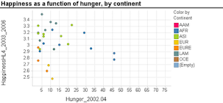
                  Scatterplots are extremely popular and useful graphical displays for examining the relationship between two numeric variables. They get even better when we add the use of color/hue and shape to include information on a third, categorical variable (or we can use size to include information on an additional numerical variable, to produce a "bubble chart"). For example, say we want to examine the relationship between the happiness of a nation and the percent of the population that live in poverty conditions -- using 2004 survey data from the World Database of Happiness. We can create a scatterplot with "Happiness" on the y-axis and "Hunger" on the x-axis. Each country will show up as a point on the scatterplot. Now, what if we want to compare across continents? We can use color! The plot below was generated using Spotfire. It took just a few seconds to generate it.

                  Now let's try creating a similar graph in Excel.
                  Creating a scatterplot in Excel is very easy. It is even not too hard to add size (by changing chart type from X Y (scatter) to Bubble chart). But adding color or shape, although possible, is very inconvenient and error-prone. Here's what you have to do (in Excel 2007, but it is similar in 2003):
                  1. Sort your data by the categorical variable (so that all rows with the same category are adjacent, e.g., first all the Africa rows, then America rows, Asia rows, etc.).
                  2. Choose only the rows that correspond to the first category (say, Africa). Create a scatterplot from these rows.
                  3. Right-click on the chart and choose "Select Data Source". Or equivalently, choose in the Chart Tools Design> Data> Select data. Click "Add" to add another series. Enter the area on the spreadsheet that corresponds to the next category (America), separately choosing the x column and y column areas. Then keep adding the rest of the categories (continents) as additional series.

                  Besides being tedious, this procedure is quite prone to error, especially if you have many categories and/or many rows. It's a shame that Excel doesn't have a simpler way to generate color-coded scatterplots - almost every other software does.


                  Thursday, August 20, 2009

                  Data Exploration Celebration: The ENBIS 2009 Challenge

                  The European Network for Business and Industrial Statistics (ENBIS) has released the 2009 ENBIS Challenge. The challenge this time is to use an exploratory data analysis (EDA) tool to answer a bunch of questions regarding sales of laptop computers in London. The data on nearly 200,000 transactions include 3 files: sales data (for each computer sold, with time stamps and zipcode locations of customer and store), computer configuration information, and geographic information linking zipcodes to GIS coordinates. Participants are challenged to answer a set of 11 questions using EDA.

                  The challenge is sponsored by JMP (by SAS), who are obviously promoting the EDA strengths of JMP (fair enough), yet analysis can be done using any software.

                  What I love about this competition is that unlike other data-based competitions such as the KDD Cup, INFORMS, or the many forecasting competitiong (e.g. NN3), it focuses solely on exploratory analysis. No data mining, no statistical models. From my experience, the best analyses rely on a good investment of time and energy in data visualization. Some of today's data visualization tools are way beyond static boxplots and histograms. Interactive visualization software such as TIBCO Spotfire (and Tableau, which I haven't tried) allow many operations such as zooming, filtering, panning. They support multivariate exploration via the use of color, shape, panels, etc. and they include specialized visualization tools such as treemaps and parallel coordinate plots.

                  And finally, although the focus is on data exploration, the business context and larger questions are stated:

                  In the spirit of a "virtuous circle of learning", the insights gained from this analysis could then used to design an appropriate choice experiment for a consumer panel to determine which characteristics of the various configurations they actually value, thus helping determine product strategy and pricing policies that will maximise Acell's projected revenues in 2009. This latter aspect is not part of the challenge as such.

                  The Business Objective:
                  Determine product strategy and pricing policies that will maximise Acell's projected revenues in 2009.

                  Management's Charter:
                  Uncover any information in the available data that may be useful in meeting the business objective, and make specific recommendations to management that follow from this (85%). Also assess the relevance of the data provided, and suggest how Acell can make better use of data in 2010 to shape this aspect of their business strategy and operations (15%).

                  Saturday, June 13, 2009

                  Histograms in Excel

                  Histograms are very useful charts for displaying the distribution of a numerical measurement. The idea is to bucket the numerical measurement into intervals, and then to display the frequency (or percentage) of records in each interval.

                  Two ways to generate a histogram in Excel are:
                  1. Create a pivot table, with the measurement of interest in the Column area, and Count of that measurement (or any measurement) in the Data area. Then, right-click the column area and "Group and Show Detail >  Group" will create the intervals. Now simply click the chart wizard to create the matching chart. You will still need to do some fixing to get a legal histogram (explanation below).
                  2. Using the Data Analysis add-in (which is usually available with ordinary installation and only requires enabling it in the Tools>Add-ins menu): the Histogram function here will only create the frequency table (the name "Histogram" is misleading!). Then, you will need to create a bar chart that reads from this table, and fix it to create a legal histogram (explanation below).
                  Needed Fix: Histogram vs. Bar Chart
                  Background: Histograms and bar charts might appear similar, because in both cases the bar heights denote frequency (or percentage). However, they are different in a fundamental way: Bar charts are meant for displaying categorical measurements, while histograms are meant for displaying numerical measurements. This is reflected by the fact that in bar charts the x-axis conveys categories (e.g., "red", "blue", "green"), whereas in histograms the x-axis conveys the numerical intervals. Hence, in bar charts the order of the bars is unimportant and we can change the "red" bar with the "green" bar. In contrast, in histograms the interval order cannot be changed: the interval 20-30 can only be located between the interval 10-20 and the interval 30-40.

                  To convey this difference between bar charts and histograms, a major feature of a histogram is that there are no gaps between the bars (making the neighboring intervals "glue" to each other). The entire "shape" of the touching bars conveys important information, not only the single bars. Hence, the default chart that Excel creates using either of the two methods above will not be a legal and useful histogram unless you remove those gaps. To do that, double-click on any of the bars, and in the Options tab reduce the Gap to 0.

                  Method comparison:
                  The pivot-table method is much faster and yields a chart that is linked to the pivot table and is interactive. It also does not require the Data Analysis add-in. However,
                  there is a serious flaw with the pivot table method: if some of the intervals contain 0 records, then those intervals will be completely absent from the pivot table, which means that the chart will be missing "bars" of height zero for those intervals! The resulting histogram will therefore be wrong!


                  Wednesday, September 03, 2008

                  Data conversion and open-source software

                  Recently I was trying to open a data file that was created in the statistical software SPSS. SPSS is widely used in the social sciences (a competitor to SAS), and appears to have some ground here in Bhutan. Being in Bhutan with slow and erratic internet connection though, I've failed once and again to use the software through our school's portal. Finding the local SPSS representative seemed a bit surreal, and so I went off trying to solve the problem in another way.

                  First stop: Googling "convert .sav to .csv" lead me nowhere. SPSS and SAS both have an annoying "feature" of keeping data in file formats that are very hard to convert. A few software packages now import data from SAS databases, but I was unable to find a software package that will import from SPSS. This lead me to a surprising finding: PSPP. Yes, that's right: PSPP, previously known as FIASCO, is an open-source "free replacement for the proprietary program, SPSS." The latest version even boasts a graphic user interface. Another interesting feature is described as "Fast statistical procedures, even on very large data sets."

                  My problem hasn't been solved as yet, because downloading PSPP and the required Cygwin software poses a challenge with my narrow bandwidth... Thus, I cannot report about the usefulness of PSPP. I'd be interested in hearing from others who have tested/used it!