The parallel coordinate plot is useful for visualizing multivariate data in a dis-aggregated way, where we have multiple numerical measurements for each record. A scatter plot displays two measurements for each record by using the two axes. A parallel coordinate plot can display many measurements for each record, by using many (parallel) axes - one for each measurement.
Showing posts with label Excel. Show all posts
Showing posts with label Excel. Show all posts
Wednesday, April 02, 2014
Friday, May 20, 2011
Nice April Fool's Day prank
The recent issue of the Journal of Computational Graphics & Statistics published a short article by Columbia Univ Prof Andrew Gelman (I believe he is the most active statistician-blogger) called "Why tables are really much better than graphs" based on his April 1, 2009 blog post (note the difference in publishing speed using blogs and refereed journals!). The last parts made me laugh hysterically - so let me share them:
About creating and reporting "good" tables:
About creating and reporting "good" tables:
It's also helpful in a table to have a minimum of four significant digits. A good choice is often to use the default provided by whatever software you have used to fit the model. Software designers have chosen their defaults for a good reason, and I'd go with that. Unnecessary rounding is risky; who knows what information might be lost in the foolish pursuit of a "clean"-looking table?About creating and reporting "good" graphs:
If you must make a graph, try only to graph unadorned raw data, so that you are not implying you have anything you do not. And I recommend using Excel, which has some really nice defaults as well as options such as those 3-D colored bar charts. If you are going to have a graph, you might as well make it pretty. I recommend a separate color for each bar—and if you want to throw in a line as well, use a separate y-axis on the right side of the graph.Note: please do not follow these instructions for creating tables and graphs! Remember, this is an April Fool's Day prank!
 |
| From Stephen Few's examples of bad visualizations (http://perceptualedge.com/examples.php) |
Monday, April 25, 2011
Google Spreadsheets for teaching probability?
In business schools it is common to teach statistics courses using Microsoft Excel, due to its wide accessibility and the familiarity of business students with the software. There is a large debate regarding this practice, but at this point the reality is clear: the figure that I am familiar with is about 50% of basic stat courses in b-schools use Excel and 50% use statistical software such as Minitab or JMP.
Another trend is moving from offline software to "cloud computing" -- Software such as www.statcrunch.com offer basic stat functions in an online, collaborative, social-networky style.
Following the popularity of spreadsheet software and the cloud trend, I asked myself whether the free Google Spreadsheets can actually do the job. This is part of my endeavors to find free (or at least widely accessible) software for teaching basic concepts. While Google Spreadsheets does have quite an extensive function list, I discovered that its current computing is very limited. For example, computing binomial probabilities using the function BINOMDIST is limited to a sample size of about 130 (I did report this problem). Similarly, HYPGEOMDIST results in overflow errors for reasonably small sample and population sizes.

From the old days when we used to compute binomial probabilities manually, I am guessing that whoever programmed these functions forgot to use the tricks that avoid computing high factorials in n-choose-k type calculations...
Saturday, April 16, 2011
Moving Average chart in Excel: what is plotted?
In my recent book Practical Time Series Forecasting: A Practical Guide, I included an example of using Microsoft Excel's moving average plot to suppress monthly seasonality. This is done by creating a line plot of the series over time and then Add Trendline > Moving Average (see my post about suppressing seasonality). The purpose of adding the moving average trendline to a time plot is to better see a trend in the data, by suppressing seasonality.
A moving average with window width w means averaging across each set of w consecutive values. For visualizing a time series, we typically use a centered moving average with w = season. In a centered moving average, the value of the moving average at time t (MAt) is computed by centering the window around time t and averaging across the w values within the window. For example, if we have daily data and we suspect a day-of-week effect, we can suppress it by a centered moving average with w=7, and then plotting the MA line.

The fact that Excel produces a trailing moving average in the Trendline menu is quite disturbing and misleading. Even more disturbing is the documentation, which incorrectly describes the trailing MA that is produced:
"If Period is set to 2, for example, then the average of the first two data points is used as the first point in the moving average trendline. The average of the second and third data points is used as the second point in the trendline, and so on."For more on moving averages, see here:
Wednesday, November 10, 2010
ASA's magazine: Excel's default charts
Being in Bhutan this year, I have requested the American Statistical Association (ASA) and INFORMS to mail the magazines that come with my membership to Bhutan. Although I can access the magazines online, I greatly enjoy receiving the issues by mail (even if a month late) and leafing through them leisurely. Not to mention the ability to share them with local colleagues who are seeing these magazines for the first time!
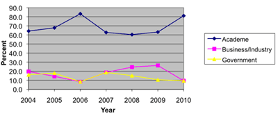
Now to the data-analytic reason for my post: The main article in the August 2010 issue of AMSTAT News (the ASA's magazine) on Fellow Award: Revisited (Again) presented an "update to previous articles about counts of fellow nominees and awardees." The article comprised of many tables and line charts. While charts are a great way to present a data-based story, the charts in this article were of low quality (see image below). Apparently, the authors used Excel 2003's defaults, which have poor graphic qualities and too much chart-junk: a dark grey background, horizontal gridlines, line color not very suitable for black-white printing (such as the print issue), a redundant combination of line color and marker shape, and redundant decimals on several of the plot y-axis labels.

As the flagship magazine of the ASA, I hope that the editors will scrutinize the graphics and data visualizations used in the articles, and perhaps offer authors access to a powerful data visualization software such as TIBCO Spotfire, Tableau, or SAS JMP. Major newspapers such as the New York Times and Washington Post now produce high-quality visualizations. Statistics magazines mustn't fall behind!
Now to the data-analytic reason for my post: The main article in the August 2010 issue of AMSTAT News (the ASA's magazine) on Fellow Award: Revisited (Again) presented an "update to previous articles about counts of fellow nominees and awardees." The article comprised of many tables and line charts. While charts are a great way to present a data-based story, the charts in this article were of low quality (see image below). Apparently, the authors used Excel 2003's defaults, which have poor graphic qualities and too much chart-junk: a dark grey background, horizontal gridlines, line color not very suitable for black-white printing (such as the print issue), a redundant combination of line color and marker shape, and redundant decimals on several of the plot y-axis labels.
As the flagship magazine of the ASA, I hope that the editors will scrutinize the graphics and data visualizations used in the articles, and perhaps offer authors access to a powerful data visualization software such as TIBCO Spotfire, Tableau, or SAS JMP. Major newspapers such as the New York Times and Washington Post now produce high-quality visualizations. Statistics magazines mustn't fall behind!
Monday, August 31, 2009
Creating color-coded scatterplots in Excel: a nightmare
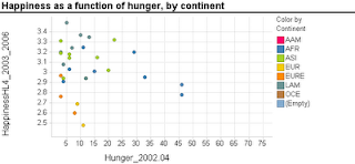
Scatterplots are extremely popular and useful graphical displays for examining the relationship between two numeric variables. They get even better when we add the use of color/hue and shape to include information on a third, categorical variable (or we can use size to include information on an additional numerical variable, to produce a "bubble chart"). For example, say we want to examine the relationship between the happiness of a nation and the percent of the population that live in poverty conditions -- using 2004 survey data from the World Database of Happiness. We can create a scatterplot with "Happiness" on the y-axis and "Hunger" on the x-axis. Each country will show up as a point on the scatterplot. Now, what if we want to compare across continents? We can use color! The plot below was generated using Spotfire. It took just a few seconds to generate it.
 Now let's try creating a similar graph in Excel.
Creating a scatterplot in Excel is very easy. It is even not too hard to add size (by changing chart type from X Y (scatter) to Bubble chart). But adding color or shape, although possible, is very inconvenient and error-prone. Here's what you have to do (in Excel 2007, but it is similar in 2003):
Besides being tedious, this procedure is quite prone to error, especially if you have many categories and/or many rows. It's a shame that Excel doesn't have a simpler way to generate color-coded scatterplots - almost every other software does.
 Now let's try creating a similar graph in Excel.
Creating a scatterplot in Excel is very easy. It is even not too hard to add size (by changing chart type from X Y (scatter) to Bubble chart). But adding color or shape, although possible, is very inconvenient and error-prone. Here's what you have to do (in Excel 2007, but it is similar in 2003):
- Sort your data by the categorical variable (so that all rows with the same category are adjacent, e.g., first all the Africa rows, then America rows, Asia rows, etc.).
- Choose only the rows that correspond to the first category (say, Africa). Create a scatterplot from these rows.
- Right-click on the chart and choose "Select Data Source". Or equivalently, choose in the Chart Tools Design> Data> Select data. Click "Add" to add another series. Enter the area on the spreadsheet that corresponds to the next category (America), separately choosing the x column and y column areas. Then keep adding the rest of the categories (continents) as additional series.
Besides being tedious, this procedure is quite prone to error, especially if you have many categories and/or many rows. It's a shame that Excel doesn't have a simpler way to generate color-coded scatterplots - almost every other software does.
Saturday, June 13, 2009
Histograms in Excel
Histograms are very useful charts for displaying the distribution of a numerical measurement. The idea is to bucket the numerical measurement into intervals, and then to display the frequency (or percentage) of records in each interval.
Two ways to generate a histogram in Excel are:
Background: Histograms and bar charts might appear similar, because in both cases the bar heights denote frequency (or percentage). However, they are different in a fundamental way: Bar charts are meant for displaying categorical measurements, while histograms are meant for displaying numerical measurements. This is reflected by the fact that in bar charts the x-axis conveys categories (e.g., "red", "blue", "green"), whereas in histograms the x-axis conveys the numerical intervals. Hence, in bar charts the order of the bars is unimportant and we can change the "red" bar with the "green" bar. In contrast, in histograms the interval order cannot be changed: the interval 20-30 can only be located between the interval 10-20 and the interval 30-40.
To convey this difference between bar charts and histograms, a major feature of a histogram is that there are no gaps between the bars (making the neighboring intervals "glue" to each other). The entire "shape" of the touching bars conveys important information, not only the single bars. Hence, the default chart that Excel creates using either of the two methods above will not be a legal and useful histogram unless you remove those gaps. To do that, double-click on any of the bars, and in the Options tab reduce the Gap to 0.
Method comparison:
The pivot-table method is much faster and yields a chart that is linked to the pivot table and is interactive. It also does not require the Data Analysis add-in. However,
there is a serious flaw with the pivot table method: if some of the intervals contain 0 records, then those intervals will be completely absent from the pivot table, which means that the chart will be missing "bars" of height zero for those intervals! The resulting histogram will therefore be wrong!
Two ways to generate a histogram in Excel are:
- Create a pivot table, with the measurement of interest in the Column area, and Count of that measurement (or any measurement) in the Data area. Then, right-click the column area and "Group and Show Detail > Group" will create the intervals. Now simply click the chart wizard to create the matching chart. You will still need to do some fixing to get a legal histogram (explanation below).
- Using the Data Analysis add-in (which is usually available with ordinary installation and only requires enabling it in the Tools>Add-ins menu): the Histogram function here will only create the frequency table (the name "Histogram" is misleading!). Then, you will need to create a bar chart that reads from this table, and fix it to create a legal histogram (explanation below).
Background: Histograms and bar charts might appear similar, because in both cases the bar heights denote frequency (or percentage). However, they are different in a fundamental way: Bar charts are meant for displaying categorical measurements, while histograms are meant for displaying numerical measurements. This is reflected by the fact that in bar charts the x-axis conveys categories (e.g., "red", "blue", "green"), whereas in histograms the x-axis conveys the numerical intervals. Hence, in bar charts the order of the bars is unimportant and we can change the "red" bar with the "green" bar. In contrast, in histograms the interval order cannot be changed: the interval 20-30 can only be located between the interval 10-20 and the interval 30-40.
To convey this difference between bar charts and histograms, a major feature of a histogram is that there are no gaps between the bars (making the neighboring intervals "glue" to each other). The entire "shape" of the touching bars conveys important information, not only the single bars. Hence, the default chart that Excel creates using either of the two methods above will not be a legal and useful histogram unless you remove those gaps. To do that, double-click on any of the bars, and in the Options tab reduce the Gap to 0.
Method comparison:
The pivot-table method is much faster and yields a chart that is linked to the pivot table and is interactive. It also does not require the Data Analysis add-in. However,
there is a serious flaw with the pivot table method: if some of the intervals contain 0 records, then those intervals will be completely absent from the pivot table, which means that the chart will be missing "bars" of height zero for those intervals! The resulting histogram will therefore be wrong!
Saturday, October 18, 2008
Microsoft and the financial downfall
One of the misleading features of Microsoft Office software is that it gives the user the illusion that they are in control of what's visible and what's hidden to readers of the files. One example is copy-pasting from an Excel sheet into a Word or Power Point. If you now double click on the embedded piece you'll see... the Excel file! It is automatically embedded within the Word/Power Point file. A few years ago, after teaching this to MBAs, a student came the following week all excited, telling me how he just detected fraudulent reporting to his company by a contractor. He simply clicked on a pasted Excel chart within the contractor's report written in Word. The embedded Excel file told all the contractor's secrets.
A solution is to "paste special> as picture". But that's only if you know about this!
Another such feature is Excel's "hidden" fields. You can "hide" certain areas on your Excel spreadsheet, but don't be surprised if those areas are not really hidden: Turns out that Barclays Capital just fell in this trap in their proposal of buying the collapsed investment bank Lehman Brothers. This week's article Lehman Excel snafu could cost Barclays dear tells the story of how "a junior law associate at Cleary Gottlieb Steen & Hamilton LLP converted an Excel file into a PDF format document... Some of these details on various trading contracts were marked as hidden because they were not intended to form part of Barclays' proposed deal. However, this "hidden" distinction was ignored during the reformatting process so that Barclays ended up offering to take on an additional 179 contracts as part of its bankruptcy buyout deal".
The moral:
(1) if you have secrets, don't keep them in Microsoft Office.
(2) if you convert your secrets from Microsoft to something safer (like PDF), check the result of the conversion carefully!
Subscribe to:
Posts (Atom)