Showing posts with label graphs. Show all posts

Friday, June 17, 2011

Scatter plots for large samples

While huge datasets have become ubiquitos in fields such as genomics, large datasets are now also becoming to infiltrate research in the social sciences. Data from eCommerce sites, online dating sites, etc. are now collected as part of research in information systems, marketing and related fields. We can now find social science research papers with hundreds of thousands of observations and more.

A common type of research question in such studies is about the relationship between two variables. For example, how does the final price of an online auction relate to the seller's feedback rating? A classic exploratory tool for examining such questions (before delving into formal data analysis) is the scatter plot. In small sample studies, scatter plots are used for exploring relationships and detecting outliers.

Image from http://prsdstudio.com/ 
With large samples, however, the scatter plot runs into a few problems. With lots of observations, there is likely to be too much overlap between markers on the scatter plot, even to the point of insufficient pixels to display all the points.

Here are some large-sample strategies to make scatter plots useful:

  1. Aggregation: display groups of observations in a certain area on the plot as a single marker. Size or color can denote the number of aggregated observations.
  2. Small-multiples: split the data into multiple scatter plots by breaking down the data into (meaningful) subsets. Breaking down the data by geographical location is one example. Make sure to use the same axis scales on all plots - this will be done automatically if your software allows "trellising".
  3. Sample: draw smaller random samples from the large dataset and plot them in multiple scatter plots (again, keep the axis scales identical on all plots).
  4. Zoom-in: examine particular areas of the scatter plot by zooming in
Finally, with large datasets it is useful to consider charts that are based on aggregation such as histograms and box plots. For more on visualization, see the Visualization chapter in Data Mining for Business Intelligence.
Wednesday, November 10, 2010

ASA's magazine: Excel's default charts

Being in Bhutan this year, I have requested the American Statistical Association (ASA) and INFORMS to mail the magazines that come with my membership to Bhutan. Although I can access the magazines online, I greatly enjoy receiving the issues by mail (even if a month late) and leafing through them leisurely. Not to mention the ability to share them with local colleagues who are seeing these magazines for the first time!

Now to the data-analytic reason for my post: The main article in the August 2010 issue of AMSTAT News (the ASA's magazine) on Fellow Award: Revisited (Again) presented an "update to previous articles about counts of fellow nominees and awardees." The article comprised of many tables and line charts. While charts are a great way to present a data-based story, the charts in this article were of low quality (see image below). Apparently, the authors used Excel 2003's defaults, which have poor graphic qualities and too much chart-junk: a dark grey background, horizontal gridlines, line color not very suitable for black-white printing (such as the print issue), a redundant combination of line color and marker shape, and redundant decimals on several of the plot y-axis labels.


As the flagship magazine of the ASA, I hope that the editors will scrutinize the graphics and data visualizations used in the articles, and perhaps offer authors access to a powerful data visualization software such as TIBCO Spotfire, Tableau, or SAS JMP. Major newspapers such as the New York Times and Washington Post now produce high-quality visualizations. Statistics magazines mustn't fall behind!

Monday, August 31, 2009

Creating color-coded scatterplots in Excel: a nightmare

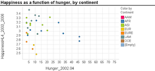
Scatterplots are extremely popular and useful graphical displays for examining the relationship between two numeric variables. They get even better when we add the use of color/hue and shape to include information on a third, categorical variable (or we can use size to include information on an additional numerical variable, to produce a "bubble chart"). For example, say we want to examine the relationship between the happiness of a nation and the percent of the population that live in poverty conditions -- using 2004 survey data from the World Database of Happiness. We can create a scatterplot with "Happiness" on the y-axis and "Hunger" on the x-axis. Each country will show up as a point on the scatterplot. Now, what if we want to compare across continents? We can use color! The plot below was generated using Spotfire. It took just a few seconds to generate it.

Now let's try creating a similar graph in Excel.
Creating a scatterplot in Excel is very easy. It is even not too hard to add size (by changing chart type from X Y (scatter) to Bubble chart). But adding color or shape, although possible, is very inconvenient and error-prone. Here's what you have to do (in Excel 2007, but it is similar in 2003):
  1. Sort your data by the categorical variable (so that all rows with the same category are adjacent, e.g., first all the Africa rows, then America rows, Asia rows, etc.).
  2. Choose only the rows that correspond to the first category (say, Africa). Create a scatterplot from these rows.
  3. Right-click on the chart and choose "Select Data Source". Or equivalently, choose in the Chart Tools Design> Data> Select data. Click "Add" to add another series. Enter the area on the spreadsheet that corresponds to the next category (America), separately choosing the x column and y column areas. Then keep adding the rest of the categories (continents) as additional series.

Besides being tedious, this procedure is quite prone to error, especially if you have many categories and/or many rows. It's a shame that Excel doesn't have a simpler way to generate color-coded scatterplots - almost every other software does.


Thursday, August 20, 2009

Data Exploration Celebration: The ENBIS 2009 Challenge

The European Network for Business and Industrial Statistics (ENBIS) has released the 2009 ENBIS Challenge. The challenge this time is to use an exploratory data analysis (EDA) tool to answer a bunch of questions regarding sales of laptop computers in London. The data on nearly 200,000 transactions include 3 files: sales data (for each computer sold, with time stamps and zipcode locations of customer and store), computer configuration information, and geographic information linking zipcodes to GIS coordinates. Participants are challenged to answer a set of 11 questions using EDA.

The challenge is sponsored by JMP (by SAS), who are obviously promoting the EDA strengths of JMP (fair enough), yet analysis can be done using any software.

What I love about this competition is that unlike other data-based competitions such as the KDD Cup, INFORMS, or the many forecasting competitiong (e.g. NN3), it focuses solely on exploratory analysis. No data mining, no statistical models. From my experience, the best analyses rely on a good investment of time and energy in data visualization. Some of today's data visualization tools are way beyond static boxplots and histograms. Interactive visualization software such as TIBCO Spotfire (and Tableau, which I haven't tried) allow many operations such as zooming, filtering, panning. They support multivariate exploration via the use of color, shape, panels, etc. and they include specialized visualization tools such as treemaps and parallel coordinate plots.

And finally, although the focus is on data exploration, the business context and larger questions are stated:

In the spirit of a "virtuous circle of learning", the insights gained from this analysis could then used to design an appropriate choice experiment for a consumer panel to determine which characteristics of the various configurations they actually value, thus helping determine product strategy and pricing policies that will maximise Acell's projected revenues in 2009. This latter aspect is not part of the challenge as such.

The Business Objective:
Determine product strategy and pricing policies that will maximise Acell's projected revenues in 2009.

Management's Charter:
Uncover any information in the available data that may be useful in meeting the business objective, and make specific recommendations to management that follow from this (85%). Also assess the relevance of the data provided, and suggest how Acell can make better use of data in 2010 to shape this aspect of their business strategy and operations (15%).

Saturday, June 13, 2009

Histograms in Excel

Histograms are very useful charts for displaying the distribution of a numerical measurement. The idea is to bucket the numerical measurement into intervals, and then to display the frequency (or percentage) of records in each interval.

Two ways to generate a histogram in Excel are:
  1. Create a pivot table, with the measurement of interest in the Column area, and Count of that measurement (or any measurement) in the Data area. Then, right-click the column area and "Group and Show Detail >  Group" will create the intervals. Now simply click the chart wizard to create the matching chart. You will still need to do some fixing to get a legal histogram (explanation below).
  2. Using the Data Analysis add-in (which is usually available with ordinary installation and only requires enabling it in the Tools>Add-ins menu): the Histogram function here will only create the frequency table (the name "Histogram" is misleading!). Then, you will need to create a bar chart that reads from this table, and fix it to create a legal histogram (explanation below).
Needed Fix: Histogram vs. Bar Chart
Background: Histograms and bar charts might appear similar, because in both cases the bar heights denote frequency (or percentage). However, they are different in a fundamental way: Bar charts are meant for displaying categorical measurements, while histograms are meant for displaying numerical measurements. This is reflected by the fact that in bar charts the x-axis conveys categories (e.g., "red", "blue", "green"), whereas in histograms the x-axis conveys the numerical intervals. Hence, in bar charts the order of the bars is unimportant and we can change the "red" bar with the "green" bar. In contrast, in histograms the interval order cannot be changed: the interval 20-30 can only be located between the interval 10-20 and the interval 30-40.

To convey this difference between bar charts and histograms, a major feature of a histogram is that there are no gaps between the bars (making the neighboring intervals "glue" to each other). The entire "shape" of the touching bars conveys important information, not only the single bars. Hence, the default chart that Excel creates using either of the two methods above will not be a legal and useful histogram unless you remove those gaps. To do that, double-click on any of the bars, and in the Options tab reduce the Gap to 0.

Method comparison:
The pivot-table method is much faster and yields a chart that is linked to the pivot table and is interactive. It also does not require the Data Analysis add-in. However,
there is a serious flaw with the pivot table method: if some of the intervals contain 0 records, then those intervals will be completely absent from the pivot table, which means that the chart will be missing "bars" of height zero for those intervals! The resulting histogram will therefore be wrong!


Wednesday, June 11, 2008

Summaries or graphs?

Herb Edelstein from Two Crows consulting introduced me to this neat example showing how graphs are much more revealing than summary statistics. This is an age-old example by Anscombe (1973). I will show a slightly updated version of Anscombe's example, by Basset et al. (1986):
We have four datasets, each containing 11 pairs of X and Y measurements. All four datasets have the same X variable, and only differ on the Y values.

Here are the summary statistics for each of the four Y variables (A, B, C, D):

A B C D
Average 20.95 20.95 20.95 20.95
Std 1.495794 1.495794 1.495794 1.495794


That's right - the mean and standard deviations are all identical. Now let's go one step further and fit the four simple linear regression models Y= a + bX + noise. Remember, the X is the same in all four datasets. Here is the output for the first dataset:
Regression Statistics
Multiple R 0.620844098
R Square 0.385447394
Adjusted R Square 0.317163771
Standard Error 1.236033081
Observations 11


Coefficients Standard Error t Stat P-value
Intercept 18.43 1.12422813 16.39347 5.2E-08
slope 0.28 0.11785113 2.375879 0.041507

Guess what? The other three regression outputs are identical!

So are the four Y variables identical???


Well, here is the answer:


To top it off, Basset included one more dataset that has the exact same summary stats and regression estimates. Here is the scatterplot:


[You can find all the data for both Anscombe's and Basset et al.'s examples here]