After a few years of employment at the Indian School of Business (in 2010 as a visitor and later as a tenured SRITNE Chaired Professor of Data Analytics), the time has come for me to get a new Employment Visa. As an Israeli-American, I decided to apply for the visa using my Israeli passport. I was almost on my way to the Indian embassy when I discovered, to my horror, that the fee is over USD $1000 for a one-year visa on an Israeli passport. The more interesting part is that Israelis are charged the highest fee compared to any other passport holder. For all other countries except UK and UAE the fee is between $100-200.
Showing posts with label data visualization. Show all posts
Showing posts with label data visualization. Show all posts
Friday, September 19, 2014
Wednesday, April 02, 2014
Parallel coordinate plot in Tableau: a workaround
The parallel coordinate plot is useful for visualizing multivariate data in a dis-aggregated way, where we have multiple numerical measurements for each record. A scatter plot displays two measurements for each record by using the two axes. A parallel coordinate plot can display many measurements for each record, by using many (parallel) axes - one for each measurement.
Wednesday, April 03, 2013
Analytics magazines: Please lead the way for effective data presentation
Professional "analytics" associations such INFORMS, the American Statistical Association, and the Royal Statistical Society, have been launching new magazines intended for broader, non-academic audiences that are involved or interested in data analytics. Several of these magazines are aesthetically beautiful with plenty of interesting articles about applications of data analysis and their impact on daily life, society, and more. Significance magazine and Analytics magazine are two examples.
The next step is for these magazines to implement what we preach regarding data presentation: use effective visualizations. In particular, the online versions can include interactive dashboards! If the New York Times and Washington Post can have interactive dashboards on their websites, so can magazines of statistics and operations research societies.
For example, the OR/MS Today magazine reports the results of an annual "statistical software survey" in the form of multi-page tables in the hardcopy and PDF versions of the magazine. These tables are not user friendly in the sense that it is difficult to explore and compare the products and tools. Surprisingly, the online implementation is even worse: a bunch of HTML pages, each with one static table.
To illustrate the point, I have converted the 2013 Statistical Software Survey results into an interactive dashboard. The user can examine and compare particular products or tools of interest using filters, sort the products by different attributes, and get a quick idea about pricing. Maybe not the most fascinating data, especially given the many missing values, yet I hope the dashboard is more effective and engaging.
The next step is for these magazines to implement what we preach regarding data presentation: use effective visualizations. In particular, the online versions can include interactive dashboards! If the New York Times and Washington Post can have interactive dashboards on their websites, so can magazines of statistics and operations research societies.
For example, the OR/MS Today magazine reports the results of an annual "statistical software survey" in the form of multi-page tables in the hardcopy and PDF versions of the magazine. These tables are not user friendly in the sense that it is difficult to explore and compare the products and tools. Surprisingly, the online implementation is even worse: a bunch of HTML pages, each with one static table.
 |
| Presenting the survey results in multi-page tables is not the most user-friendly (from Feb 2013 issue of OR/MS Today magazine) |
 |
| Interactive dashboard. Click on the image to go to the dashboard |
Monday, April 02, 2012
The world is flat? Only for US students
Learning and teaching has become a global endeavor with lots of online resources and technologies. Contests are an effective way to engage a diverse community from around the world. In the past I have written several posts about contests and competitions in data mining, statistics and more. And now about a new one.
Tableau is a US-based company that sells a cool data visualization tool (there's a free version too). The company has recently seen huge growth with lots of new adopters in industry and academia. Their "Tableau for teaching" (TfT) program is intended to assist instructors and teachers by providing software and resources for data visualization courses. The program is promoted as global "Tableau for Teaching Around the World" (see the interactive dashboard at the bottom of this post). As part of this program, a student contest was recently launched where students are provided with real data and are challenged to produce good visualizations that tell compelling stories. The data are from Lesotho, Africa (given by the NGO CARE) and the prizes are handsome. I was almost getting excited about this contest (non-US data, visualization, nice prizes for students) when I read the draconian contest eligibility rules:
 I was deeply disappointed. Not only does the contest exclude non-US students (even branches of US universities outside of the US are excluded!), but more disturbing is the fact that only US residents can win a prize for telling a story about lives of people in Lesotho. Condescending? Wouldn't local Lesotho students (or at least students in the region) be the most knowledgeable about the meaning of the data? Wouldn't they be the ones most qualified to tell the story of Lesotho people that emerges from the data? Wouldn't they be the first to identify surprising patterns or exceptions and even wrong data?
While one country "telling the story" of another country is common at the political level, there is no reason that open-minded private visualization software companies should endorse the same behavior. If the problem of awarding cash prizes to non-US citizens is tax-related, I am sure there are creative ways, such as giving free software licenses, to offer prizes that can be distributed to any enthusiastic and talented student of visualization around the world. In short, I call Tableau to change the rules and follow CARE's motto "Defending Dignity".
Tableau is a US-based company that sells a cool data visualization tool (there's a free version too). The company has recently seen huge growth with lots of new adopters in industry and academia. Their "Tableau for teaching" (TfT) program is intended to assist instructors and teachers by providing software and resources for data visualization courses. The program is promoted as global "Tableau for Teaching Around the World" (see the interactive dashboard at the bottom of this post). As part of this program, a student contest was recently launched where students are provided with real data and are challenged to produce good visualizations that tell compelling stories. The data are from Lesotho, Africa (given by the NGO CARE) and the prizes are handsome. I was almost getting excited about this contest (non-US data, visualization, nice prizes for students) when I read the draconian contest eligibility rules:
ELIGIBILITY: The Tableau Student Data Challenge Contest (“The Awards,” “Contest” or “Promotion”) is offered and open only to legal residents of the 50 United States and the District of Columbia (“United States”) who at time of entry (a) are the legal age of majority in their state of residence; (b) physically reside in the United States; (c) are enrolled as a college or university accredited in the United States; and (d) are not an Ineligible Person
 I was deeply disappointed. Not only does the contest exclude non-US students (even branches of US universities outside of the US are excluded!), but more disturbing is the fact that only US residents can win a prize for telling a story about lives of people in Lesotho. Condescending? Wouldn't local Lesotho students (or at least students in the region) be the most knowledgeable about the meaning of the data? Wouldn't they be the ones most qualified to tell the story of Lesotho people that emerges from the data? Wouldn't they be the first to identify surprising patterns or exceptions and even wrong data?
While one country "telling the story" of another country is common at the political level, there is no reason that open-minded private visualization software companies should endorse the same behavior. If the problem of awarding cash prizes to non-US citizens is tax-related, I am sure there are creative ways, such as giving free software licenses, to offer prizes that can be distributed to any enthusiastic and talented student of visualization around the world. In short, I call Tableau to change the rules and follow CARE's motto "Defending Dignity".
Tuesday, March 13, 2012
Data liberation via visualization
"Data democratization" movements try to make data, and especially government-held data, publicly available and accessible. A growing number of technological efforts are devoted to such efforts and especially the accessibility part. One such effort is by data visualization companies. A recent trend is to offer a free version (or at least free for some period) that is based on sharing your visualization and/or data to the Web. The "and/or" here is important, because in some cases you cannot share your data, but you would like to share the visualizations with the world. This is what I call "data liberation via visualization". This is the case with proprietary data, and often even if I'd love to make data publicly available, I am not allowed to do so by binding contracts.
 As part of a "data liberation via visualization" initiative, I went in search of a good free solution for disseminating interactive visualization dashboards while protecting the actual data. Two main free viz players in the market are TIBCO Spotfire Silver (free 1-year license Personal version), and Tableau Public (free). Both allow *only* public posting of your visualizations (if you want to save visualizations privately you must get the paid versions). That's fine. However, public posting of visualizations with these tools comes with a download button that make your data public as well.
I then tried MicroStrategy Cloud Personal (free Beta version), which does allow public (and private!) posting of visualizations and does not provide a download button. Of course, in order to make visualizations public, the data must sit on a server that can be reached from the visualization. All the free public-posting tools keep your data on the company's servers, so you must trust the company to protect the confidentiality and safety of your data. MicroStrategy uses a technology where the company itself cannot download your data (your Excel sheet is converted to in-memory cubes that are stored on the server). Unfortunately, the tool lacks the ability to create dashboards with multiple charts (combining multiple charts into a fully-linked interactive view).
Speaking of features, Tableau Public is the only one that has full-fledged functionality like its cousin paid tools. Spotfire Silver Personal is stripped from highly useful charts such as scatterplots and boxplots. MicroStrategy Cloud Personal lacks multi-view dashboards and for now accepts only Excel files as input.
Wednesday, July 27, 2011
Analytics: You want to be in Asia
Business Intelligence and Data Mining have become hot buzzwords in the West. Using Google Insights for Search to "see what the world is searching for" (see image below), we can see that the popularity of these two terms seems to have stabilized (if you expand the search to 2007 or earlier, you will see the earlier peak and also that Data Mining was hotter for a while). Click on the image to get to the actual result, with which you can interact directly. There are two very interesting insights from this search result:
- Looking at the "Regional Interest" for these terms, we see that the #1 country searching for these terms is India! Hong Kong and Singapore are also in the top 5. A surge of interest in Asia!
- Adding two similar terms that have the term Analytics, namely Business Analytics and Data Analytics, unveils a growing interest in Analytics (whereas the two non-analytics terms have stabilized after their peak).
 |
| Click on the image to refresh the Google Insight for Search result (in a new window) |
Friday, June 17, 2011
Scatter plots for large samples
While huge datasets have become ubiquitos in fields such as genomics, large datasets are now also becoming to infiltrate research in the social sciences. Data from eCommerce sites, online dating sites, etc. are now collected as part of research in information systems, marketing and related fields. We can now find social science research papers with hundreds of thousands of observations and more.
A common type of research question in such studies is about the relationship between two variables. For example, how does the final price of an online auction relate to the seller's feedback rating? A classic exploratory tool for examining such questions (before delving into formal data analysis) is the scatter plot. In small sample studies, scatter plots are used for exploring relationships and detecting outliers.
With large samples, however, the scatter plot runs into a few problems. With lots of observations, there is likely to be too much overlap between markers on the scatter plot, even to the point of insufficient pixels to display all the points.
Here are some large-sample strategies to make scatter plots useful:
A common type of research question in such studies is about the relationship between two variables. For example, how does the final price of an online auction relate to the seller's feedback rating? A classic exploratory tool for examining such questions (before delving into formal data analysis) is the scatter plot. In small sample studies, scatter plots are used for exploring relationships and detecting outliers.
 |
| Image from http://prsdstudio.com/ |
Here are some large-sample strategies to make scatter plots useful:
- Aggregation: display groups of observations in a certain area on the plot as a single marker. Size or color can denote the number of aggregated observations.
- Small-multiples: split the data into multiple scatter plots by breaking down the data into (meaningful) subsets. Breaking down the data by geographical location is one example. Make sure to use the same axis scales on all plots - this will be done automatically if your software allows "trellising".
- Sample: draw smaller random samples from the large dataset and plot them in multiple scatter plots (again, keep the axis scales identical on all plots).
- Zoom-in: examine particular areas of the scatter plot by zooming in
Finally, with large datasets it is useful to consider charts that are based on aggregation such as histograms and box plots. For more on visualization, see the Visualization chapter in Data Mining for Business Intelligence.
Friday, May 20, 2011
Nice April Fool's Day prank
The recent issue of the Journal of Computational Graphics & Statistics published a short article by Columbia Univ Prof Andrew Gelman (I believe he is the most active statistician-blogger) called "Why tables are really much better than graphs" based on his April 1, 2009 blog post (note the difference in publishing speed using blogs and refereed journals!). The last parts made me laugh hysterically - so let me share them:
About creating and reporting "good" tables:
About creating and reporting "good" tables:
It's also helpful in a table to have a minimum of four significant digits. A good choice is often to use the default provided by whatever software you have used to fit the model. Software designers have chosen their defaults for a good reason, and I'd go with that. Unnecessary rounding is risky; who knows what information might be lost in the foolish pursuit of a "clean"-looking table?About creating and reporting "good" graphs:
If you must make a graph, try only to graph unadorned raw data, so that you are not implying you have anything you do not. And I recommend using Excel, which has some really nice defaults as well as options such as those 3-D colored bar charts. If you are going to have a graph, you might as well make it pretty. I recommend a separate color for each bar—and if you want to throw in a line as well, use a separate y-axis on the right side of the graph.Note: please do not follow these instructions for creating tables and graphs! Remember, this is an April Fool's Day prank!
 |
| From Stephen Few's examples of bad visualizations (http://perceptualedge.com/examples.php) |
Saturday, April 16, 2011
Moving Average chart in Excel: what is plotted?
In my recent book Practical Time Series Forecasting: A Practical Guide, I included an example of using Microsoft Excel's moving average plot to suppress monthly seasonality. This is done by creating a line plot of the series over time and then Add Trendline > Moving Average (see my post about suppressing seasonality). The purpose of adding the moving average trendline to a time plot is to better see a trend in the data, by suppressing seasonality.
A moving average with window width w means averaging across each set of w consecutive values. For visualizing a time series, we typically use a centered moving average with w = season. In a centered moving average, the value of the moving average at time t (MAt) is computed by centering the window around time t and averaging across the w values within the window. For example, if we have daily data and we suspect a day-of-week effect, we can suppress it by a centered moving average with w=7, and then plotting the MA line.

The fact that Excel produces a trailing moving average in the Trendline menu is quite disturbing and misleading. Even more disturbing is the documentation, which incorrectly describes the trailing MA that is produced:
"If Period is set to 2, for example, then the average of the first two data points is used as the first point in the moving average trendline. The average of the second and third data points is used as the second point in the trendline, and so on."For more on moving averages, see here:
Saturday, April 09, 2011
Visualizing time series: suppressing one pattern to enhance another pattern
Visualizing a time series is an essential step in exploring its behavior. Statisticians think of a time series as a combination of four components: trend, seasonality, level and noise. All real-world series contain a level and noise, but not necessarily a trend and/or seasonality. It is important to determine whether trend and/or seasonality exist in a series in order to choose appropriate models and methods for descriptive or forecasting purposes. Hence, looking at a time plot, typical questions include:
 An example is shown in the Figure. The top left plot is the original series (showing monthly ridership on Amtrak trains). The bottom left panel shown a moving average line, suppressing seasonality and showing the trend. The top right panel shows a model that captures the seasonality. The lower left panel shows the residuals from the model, again enhancing the trend.
For further details and examples, see my recently published book Practical Time Series Forecasting: A Hands On Guide (available in soft-cover and as an eBook).
- is there a trend? if so, what type of function can approximate it? (linear, exponential, etc.) is the trend fixed throughout the period or does it change over time?
- is there seasonal behavior? if so, is seasonality additive or multiplicative? does seasonal behavior change over time?
- Plot annual data (either annual averages or sums)
- Plot a moving average (an average over a window of 12 months centered around each particular month)
- Plot 12 separate series, one for each month (e.g., one series for January, another for February and so on)
- Fit a model that captures monthly seasonality (e.g., a regression model with 11 monthly dummies) and look at the residual series
 An example is shown in the Figure. The top left plot is the original series (showing monthly ridership on Amtrak trains). The bottom left panel shown a moving average line, suppressing seasonality and showing the trend. The top right panel shows a model that captures the seasonality. The lower left panel shows the residuals from the model, again enhancing the trend.
For further details and examples, see my recently published book Practical Time Series Forecasting: A Hands On Guide (available in soft-cover and as an eBook).
Sunday, November 14, 2010
Data visualization in the media: Interesting video
A colleague who knows my fascination with data visualization pointed me to a recent interesting video created by Geoff McGhee on Journalism in the Age of Data. In this 8-part video, he interviews media people who create visualizations for their websites at the New York Times, Washington Post, CNBC, and more. It is interesting to see their view of why interactive visualization might be useful to their audience, and how it is linked to "good journalism".
Also interviewed are a few visualization interface developers (e.g., IBM's Many Eyes designers) as well as Infographics experts and participants at the major Inforgraphics conference in Pamplona, Spain. The line between beautiful visualizations (art) and effective ones is discussed in Part IV ("too sexy for its own good" - Gert Nielsen) - see also John Grimwade's article.
Journalism in the Age of Data from Geoff McGhee on Vimeo.
The videos can be downloaded as a series of 8 podcasts, for those with narrower bandwidth.
Wednesday, November 10, 2010
ASA's magazine: Excel's default charts
Being in Bhutan this year, I have requested the American Statistical Association (ASA) and INFORMS to mail the magazines that come with my membership to Bhutan. Although I can access the magazines online, I greatly enjoy receiving the issues by mail (even if a month late) and leafing through them leisurely. Not to mention the ability to share them with local colleagues who are seeing these magazines for the first time!
Now to the data-analytic reason for my post: The main article in the August 2010 issue of AMSTAT News (the ASA's magazine) on Fellow Award: Revisited (Again) presented an "update to previous articles about counts of fellow nominees and awardees." The article comprised of many tables and line charts. While charts are a great way to present a data-based story, the charts in this article were of low quality (see image below). Apparently, the authors used Excel 2003's defaults, which have poor graphic qualities and too much chart-junk: a dark grey background, horizontal gridlines, line color not very suitable for black-white printing (such as the print issue), a redundant combination of line color and marker shape, and redundant decimals on several of the plot y-axis labels.

As the flagship magazine of the ASA, I hope that the editors will scrutinize the graphics and data visualizations used in the articles, and perhaps offer authors access to a powerful data visualization software such as TIBCO Spotfire, Tableau, or SAS JMP. Major newspapers such as the New York Times and Washington Post now produce high-quality visualizations. Statistics magazines mustn't fall behind!
Now to the data-analytic reason for my post: The main article in the August 2010 issue of AMSTAT News (the ASA's magazine) on Fellow Award: Revisited (Again) presented an "update to previous articles about counts of fellow nominees and awardees." The article comprised of many tables and line charts. While charts are a great way to present a data-based story, the charts in this article were of low quality (see image below). Apparently, the authors used Excel 2003's defaults, which have poor graphic qualities and too much chart-junk: a dark grey background, horizontal gridlines, line color not very suitable for black-white printing (such as the print issue), a redundant combination of line color and marker shape, and redundant decimals on several of the plot y-axis labels.
As the flagship magazine of the ASA, I hope that the editors will scrutinize the graphics and data visualizations used in the articles, and perhaps offer authors access to a powerful data visualization software such as TIBCO Spotfire, Tableau, or SAS JMP. Major newspapers such as the New York Times and Washington Post now produce high-quality visualizations. Statistics magazines mustn't fall behind!
Wednesday, January 06, 2010
Creating map charts
With the growing amount of available geographical data, it is useful to be able to visualize one's data on top of a map. Visualizing numeric and/or categorical information on top of a map is called a map chart.
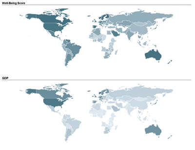
Two student teams in my Fall data mining class explored and displayed their data on map charts: one team compared economic, political, and well-being measures across different countries in the world. By linking a world map to their data, they could use color (hue and shading) to compare countries and geographical areas on those measures. Here's an example of two maps that they used. The top map uses shading to denote the average "well-being" score of a country (according to a 2004 Gallup poll), and the bottom map uses shading to denote the country's GDP. In both maps darker means higher.
 Another team used a map to compare nursing homes in the US, in terms of quality of care scores. Their map below show the average quality of nursing home in each US State (darker means higher quality).
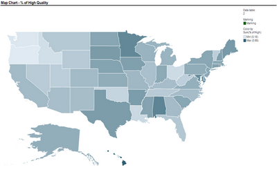 These two sets of maps were created using TIBCO Spotfire. Following many requests, here is an explanation of how to create a map chart in Spotfire. Once you have your ordinary data file open, there are 3 steps to add the map component:
I thank Smith MBA students Dan Curtis, Erica Eisenhart, John Geraghty and Ben Meadema for their contributions to this post.
Two student teams in my Fall data mining class explored and displayed their data on map charts: one team compared economic, political, and well-being measures across different countries in the world. By linking a world map to their data, they could use color (hue and shading) to compare countries and geographical areas on those measures. Here's an example of two maps that they used. The top map uses shading to denote the average "well-being" score of a country (according to a 2004 Gallup poll), and the bottom map uses shading to denote the country's GDP. In both maps darker means higher.
 Another team used a map to compare nursing homes in the US, in terms of quality of care scores. Their map below show the average quality of nursing home in each US State (darker means higher quality).
 These two sets of maps were created using TIBCO Spotfire. Following many requests, here is an explanation of how to create a map chart in Spotfire. Once you have your ordinary data file open, there are 3 steps to add the map component:
- Obtain the threesome of "shapefiles" needed to plot the map of interest: .shp file, .dbf file, and .shx file (see Wikipedia for an explanation of each)
- Open the shapefile in Spotfire (Open>New Visualization> Map Chart, then upload the shp file in Map Chart Properties> Data tab> Map data table)
- Link the map table to your data table using the Map Chart Properties> Data tab > Related data table for coloring (you will need a unique identifier linking your data table with the map table)
I thank Smith MBA students Dan Curtis, Erica Eisenhart, John Geraghty and Ben Meadema for their contributions to this post.
Friday, May 18, 2007
The good, bad and ugly graphs
In his May 2007 newsletter Stephen Few, a data visualization guru with an expertise in business data, created the The Graph Design I.Q. Test. "This brief I.Q. test leads you through a series of 10 questions that ask you to choose which of two graphs presents the data more effectively".
I took it myself (and Stephen is probably tracking my answers!) -- it's very cool and quickly teaches a good lesson in good vs. bad graphics and tables. You will be strongly discouraged after it to abuse color, 3D, etc.
If you got hooked, Stephen has a big bag of goodies for those who want to learn about creating good graphs and tables. He wrote a beautiful book called "show me the numbers"

His website's Library also included an abundance of useful articles.
I took it myself (and Stephen is probably tracking my answers!) -- it's very cool and quickly teaches a good lesson in good vs. bad graphics and tables. You will be strongly discouraged after it to abuse color, 3D, etc.
If you got hooked, Stephen has a big bag of goodies for those who want to learn about creating good graphs and tables. He wrote a beautiful book called "show me the numbers"
His website's Library also included an abundance of useful articles.
Subscribe to:
Posts (Atom)