Wednesday, January 06, 2010

Creating map charts

With the growing amount of available geographical data, it is useful to be able to visualize one's data on top of a map. Visualizing numeric and/or categorical information on top of a map is called a map chart.

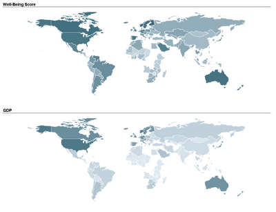
Two student teams in my Fall data mining class explored and displayed their data on map charts: one team compared economic, political, and well-being measures across different countries in the world. By linking a world map to their data, they could use color (hue and shading) to compare countries and geographical areas on those measures. Here's an example of two maps that they used. The top map uses shading to denote the average "well-being" score of a country (according to a 2004 Gallup poll), and the bottom map uses shading to denote the country's GDP. In both maps darker means higher.

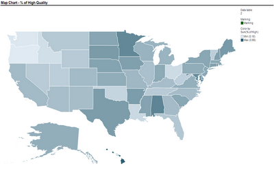
Another team used a map to compare nursing homes in the US, in terms of quality of care scores. Their map below show the average quality of nursing home in each US State (darker means higher quality).These two sets of maps were created using TIBCO Spotfire. Following many requests, here is an explanation of how to create a map chart in Spotfire. Once you have your ordinary data file open, there are 3 steps to add the map component:
  1. Obtain the threesome of "shapefiles" needed to plot the map of interest: .shp file, .dbf file, and .shx file (see Wikipedia for an explanation of each)
  2. Open the shapefile in Spotfire (Open>New Visualization> Map Chart, then upload the shp file in Map Chart Properties> Data tab> Map data table)
  3. Link the map table to your data table using the Map Chart Properties> Data tab > Related data table for coloring (you will need a unique identifier linking your data table with the map table)
The tricky part is obtaining shapefiles. One good source with free files is Blue Marble Geographics (thanks to Dan Curtis for this tip!). For US state and county data, shapefiles can be obtained from the US Census Bureau website (thanks to Ben Meadema for this one!) I'm still in search for more sources (for Europe and Asia, for instance).

I thank Smith MBA students Dan Curtis, Erica Eisenhart, John Geraghty and Ben Meadema for their contributions to this post.

Wednesday, December 23, 2009

My newest batch of graduating data mining MBAs


Congratulations to our Smith School's Fall 2009 "Data Mining for Business" students. I look forward to hearing about your future endeavors -- use data mining to do good!

Saturday, December 12, 2009

Stratified sampling: why and how?

In surveys and polls it is common to use stratified sampling. Stratified sampling is also used in data mining, when drawing a sample from a database (for the purpose of model building). This post follows an active discussion about stratification that we had in the "Scientific Data Collection" PhD class. Although stratified sampling is very useful in practice, the explanation of why to do it and how to do it usefully is not straightforward; this stuff is only briefly touched upon in basic stats courses. Looking at the current Wikipedia entry further supports the knowledge gap.

What is stratifying? (that's the easy part)
Let's start by mentioning what an ordinary (not stratified) sample is: a "simple random sample" of size n means that we draw n records from the population at random. It's like drawing the numbers from a bag in Bingo.
Stratifying a population means dividing it into non-overlapping groups (called strata), where each unit in the population belongs to exactly one stratum. A straightforward example is stratifying the world's human inhabitants by gender. Of course various issues can arise such as duplications, but that's another story. A stratified (random) sample then means drawing a simple random sample from each stratum. In the gender example, we'd draw a simple random sample of females and a simple random sample of males. The combined samples would be our "stratified sample".

Why stratify?
The main reason for stratifying is to improve the precision of whatever we're estimating. We could be interested in measuring the average weight of 1-year old babies in a continent; the proportion of active voters in a country; the difference between the average salary of men and women in an industry; the change in the percent of overweight adults after opening the first MacDonalds in a country (compared to the percent beforehand).

Because we are estimating a population quantity using only a sample (=a subset of the population), there is some inaccuracy in our sample estimate. The average weight in our sample is not identical to the average weight in the entire population. As we increase the sample size, a "good" estimate will become more precise (meaning that its variability from sample to sample will decrease). Stratifying can help improve the precision of a sample estimate without increasing the sample size. In other words, you can get the same level of precision by either drawing a larger simple random sample, or by drawing a stratified random sample of a smaller size. But this benefit will only happen if you stratify "smartly". Otherwise there will be no gain over a simple random sample.

How to stratify smartly?
This is the tricky part. The answer depends on what you are trying to measure.

If we are interested in an overall population measure (e.g., a population average, total or proportion), then the following rule will help you benefit from stratification:Create strata such that each stratum is homogeneous in terms of what's being measured.

Example: If we're measuring the average weight of 1-year-old babies in a continent, then stratifying by gender is a good idea: The boys' stratum will be more homogeneous in terms of weight compared to mixing boys and girls (and similarly the girls' stratum will be homogeneous in terms of weight). What are other good stratifying criteria that would create groups of homogeneous baby weights? How about country? the parents' weights?

If we are interested in comparing measures of two populations, then the same idea applies, but requires more careful consideration: Create strata such that each stratum is homogeneous in terms of the difference between the two population measures.

Example: To compare the % of overweight adults in a country before and after opening the first MacDonalds, stratification means finding a criterion that creates strata that are homogeneous in terms of the difference of before/after weight. One direction is to look for populations who would be affected differently by opening the MacDonalds. For example, we could use income or some other economic status measure. If in the country of interest MacDonalds is relatively cheap (e.g., the US), then the weight difference would be more pronounced in the poor stratum; in contrast, if in the country of interest MacDonalds is relatively expensive (e.g., in Asia), then the weight difference would be less pronounced in the poor stratum and more pronounced in the wealthy stratum. In either country, using economic status as a stratifying criterion is likely to create strata that are homogeneous in terms of the difference of interest.

In data mining, taking a stratified sample is used in cases where a certain class is rare in the population and we want to make sure that we have sufficient representation of that class in our sample. This is called over-sampling. A classic example is in direct mail marketing, where the rate of responders is usually very low (under 1%). To build a model that can discriminate responders from non-responders usually requires a minimum sample of each class. In predictive tasks (such as predicting the probability of a new person responding to the offer) the interest is not directly in estimating the population parameters. Yet, the precision of the estimated coefficients (i.e., their variance) influences the predictive accuracy of model. Hence, oversampling can improve predictive accuracy by again lowering the sampling variance. This conclusion is my own, and I have not seen mention of this last point anywhere. Comments are most welcome!
Saturday, November 07, 2009

The value of p-values: Science magazine asks

My students know how I cringe when I am forced to teach them p-values. I have always felt that their meaning is hard to grasp, and hence they are mostly abused when used by non-statisticians. This is clearly happening in research using large datasets, where p-values are practically useless for inferring practical importance of effects (check out our latest paper on the subject, which looks at large-dataset research in Information Systems).

So, when one of the PhD students taking my "Scientific Data Collection" course stumbled upon this recent Science Magazine article "Mission Improbable: A Concise and Precise Definition of P-Value" he couldn't resist emailing it to me. The article showcases the abuse of p-values in medical research due their illusive meaning. This is not even with large samples! Researchers incorrectly interpret the meaning of a p-value to be the probability of an effect rather than its statistical significance. The result of such confusion can clearly be devastating when the issue at stake is the effectiveness of a new drug or vaccine.

There are obviously better ways for assessing statistical significance, which are better aligned with practical significance and are also less ambiguous than p-values. One is confidence intervals. You get an estimate of your effect plus/minus some margin. You can then evaluate what the interval means practically. Another approach (good to try both) is to test predictive accuracy of your model, to see whether the prediction error is at a reasonable level -- this is achieved by applying your model to new data, and evaluating how well it fits those new data.

Shockingly enough, people seem to really want to use p-values, even if they don't understand them. I recently was involved in designing materials for a basic course on statistics for engineers and managers in a big company. We created an innovative and beautiful set of slides, with real examples, straightforward explanations, and practical advice. The 200+ slides did not have mention of p-values, but rather focused on measuring effects, understanding sampling variability, standard errors and confidence intervals, seeing the value of residual analysis in linear regression, and learning how to perform and evaluate prediction. Yet, we were requested by the company to replace some of this material ("not sure if we will need residual analysis, sampling error etc. our target audience may not use it") with material on p-values and on the 0.05 threshold ("It will be sufficient to know interpreting the p-value and R-sq to interpret the results"). Sigh.
It's hard to change a culture with such a long history.

Tuesday, October 27, 2009

Testing directional hypotheses: p-values can bite

I've recently had interesting discussions with colleagues in Information Systems regarding testing directional hypotheses. Following their request, I'm posting about this apparently illusive issue.

In information systems research, the most common type of hypothesis is directional, i.e. the parameter of interest is hypothesized to go in a certain direction. An example would be testing the hypothesis that teenagers are more likely than older folks to use Facebook. Another example is the hypothesis that higher opening bids on eBay lead to higher final prices. In the Facebook example, the researcher would test the hypothesis by gathering data on Facebook usage by each age group, then comparing the average usage of each group, and if the teenager's average is sufficiently larger, then the hypothesis would be supported (at some statistically significant level). In the eBay example, a researcher might collect information on many eBay auctions, then fit a regression of price on the opening bid (and controlling for all other types of factors). If the regression coefficient turns out to be sufficiently larger than zero, then the researcher could conclude that the hypothesized effect is true (let's put aside issues of causality for the moment).

More formally, for the Facebook hypothesis the test statistic would be a T statistic of the form
T = (teenager Average - older folks Average) / Standard Error
The test statistic for the eBay example would also be a T statistics of the form:
T = opening-bid regression coefficient / Standard Error

Note an important point here: when stating a hypothesis as above (namely, "the alternative hypothesis"), there is always a null hypothesis that is the default. This null hypothesis is often neglected to be mentioned expliciltly in Information Systems articles, but let's make clear that in directional hypotheses such as the ones above, the null hypothesis includes both the "no effect" and the "opposite directional effect" scenarios. In the Facebook example, the null includes both the case that teenagers and older folks use Facebook equally, and that teenagers use Facebook less than older folks. In the eBay example, the null includes both cases of "opening bid doesn't affect final price" and "opening bid lowers final price".

Getting back to the T test statistics (or any other test statistic, for this matter): To evaluate whether the T is sufficiently extreme to reject the null hypothesis (and support the researcher's hypothesis), information systems researchers typically use a p-value, and compare it to some significince level. BUT, computing the p-values must take into account the directionality of the hypothesis! The default p-value that you'd get from running a regression model in any standard software is for a non-directional hypothesis! To get the directional p-value you would either divide that p-value by 2, if the sign of the T statistic is in the "right" direction (positive if your hypothesis said positive; negative if your hypothesis said negative), or you would have to use 1-p-value/2. In the first case, mistakenly using the software p-value would result in missing out on real effects (loss of statistical power), while in the latter case you might infer an effect, when there is none (or maybe there even is an effect in the opposite direction).

The solution to this confusion is to examine each hypothesis for its directionality (think what the null hypothesis is), then construct the corresponding p-value carefully. Some tests in some software packages will allow you to specify the direction and will give you a "kosher" p-value. But in many cases, regression being an example, most software will only spit out the no-directional p-value. Or just get a die-hard statistician on board.

Which reminds me again why I don't like p-values. For lovers of confidence intervals, I promise to post about confidence intervals for directional hypotheses (what is the sound of a one-sided confidence interval?)


Friday, October 09, 2009

SAS On Demand: Enterprise Miner -- Update

Following up on my previous posting about using SAS Enterprise Minder via the On Demand platform: From continued communication with experts at SAS, it turns out that with the EM version 5.3, which is the one available through On Demand, there is no way to work (or even access) non-SAS files. Their suggestion solution is to use some other SAS product like SAS BASE, or even SAS JMP (which is available through the On Demand platform) in order to convert your CSV files to SAS data files...

From both a pedagogical and practical point of view, I am reluctant to introduce SAS EM through On Demand to my MBA students. They will dislike the idea of downloading, learning, and using yet another software package (even if it is a client) just for the purpose of file conversion (from ordinary CSV files into SAS data files).

So at this point it seems as though SAS EM via the On Demand platform may be useful in SAS-based courses that use SAS data files. Hopefully SAS will upgrade the version to the latest, which is supposed to be able to handle non-SAS data files.

Saturday, October 03, 2009

SAS On Demand: Enterprise Miner

I am in the process of trying out SAS Enterprise Miner via the (relatively new) SAS On Demand for Academics. In our MBA data mining course at Smith, we introduce SAS EM. In the early days, we'd get individual student licenses and have each student install the software on their computer. However, the software took too much space and it was also very awkward to circulate a packet of CDs between multiple students. We then moved to the Server option, where SAS EM is available on the Smith School portal. Although it solved the individual installation and storage issues, the portal version is too slow to be practically useful for even a modest project. Disconnects and other problems have kept students away. So now I am hoping that the On Demand service that SAS offers (which they call SODA) will work.

For the benefit of other struggling instructors, here's my experience thus far: I have been unable to access any non-SAS data files, and therefore unable to evaluate the product. The On Demand version installed is EM 5.3, which is still very awkward in terms of importing data, and especially non-SAS data.  It requires uploading files to the SAS server via FTP, and then opening SAS EM, creating a new project, and then inserting a line or two of SAS code into the non-obvious "startup code" tab. The code includes a LIBNAME statement for creating a path to one's library, and a FILENAME statement in order to reach files in that library (thank goodness I learned SAS programming as an undergrad!). Definitely not for the faint of heart, and I suspect that MBAs won't love this either.

I've been in touch with SAS support and thus far we haven't solved the data access issue, although they helped me find the path where my files were sitting in (after logging in to SAS On Demand For Academics, and clicking on your course, click on "how to use this directory").

If you have been successful with this process, please let me know!
I will post updates when I conquer this, one way or another.