Wednesday, December 23, 2009

My newest batch of graduating data mining MBAs


Congratulations to our Smith School's Fall 2009 "Data Mining for Business" students. I look forward to hearing about your future endeavors -- use data mining to do good!
Saturday, December 12, 2009

Stratified sampling: why and how?

In surveys and polls it is common to use stratified sampling. Stratified sampling is also used in data mining, when drawing a sample from a database (for the purpose of model building). This post follows an active discussion about stratification that we had in the "Scientific Data Collection" PhD class. Although stratified sampling is very useful in practice, the explanation of why to do it and how to do it usefully is not straightforward; this stuff is only briefly touched upon in basic stats courses. Looking at the current Wikipedia entry further supports the knowledge gap.

What is stratifying? (that's the easy part)
Let's start by mentioning what an ordinary (not stratified) sample is: a "simple random sample" of size n means that we draw n records from the population at random. It's like drawing the numbers from a bag in Bingo.
Stratifying a population means dividing it into non-overlapping groups (called strata), where each unit in the population belongs to exactly one stratum. A straightforward example is stratifying the world's human inhabitants by gender. Of course various issues can arise such as duplications, but that's another story. A stratified (random) sample then means drawing a simple random sample from each stratum. In the gender example, we'd draw a simple random sample of females and a simple random sample of males. The combined samples would be our "stratified sample".

Why stratify?
The main reason for stratifying is to improve the precision of whatever we're estimating. We could be interested in measuring the average weight of 1-year old babies in a continent; the proportion of active voters in a country; the difference between the average salary of men and women in an industry; the change in the percent of overweight adults after opening the first MacDonalds in a country (compared to the percent beforehand).

Because we are estimating a population quantity using only a sample (=a subset of the population), there is some inaccuracy in our sample estimate. The average weight in our sample is not identical to the average weight in the entire population. As we increase the sample size, a "good" estimate will become more precise (meaning that its variability from sample to sample will decrease). Stratifying can help improve the precision of a sample estimate without increasing the sample size. In other words, you can get the same level of precision by either drawing a larger simple random sample, or by drawing a stratified random sample of a smaller size. But this benefit will only happen if you stratify "smartly". Otherwise there will be no gain over a simple random sample.

How to stratify smartly?
This is the tricky part. The answer depends on what you are trying to measure.

If we are interested in an overall population measure (e.g., a population average, total or proportion), then the following rule will help you benefit from stratification:Create strata such that each stratum is homogeneous in terms of what's being measured.

Example: If we're measuring the average weight of 1-year-old babies in a continent, then stratifying by gender is a good idea: The boys' stratum will be more homogeneous in terms of weight compared to mixing boys and girls (and similarly the girls' stratum will be homogeneous in terms of weight). What are other good stratifying criteria that would create groups of homogeneous baby weights? How about country? the parents' weights?

If we are interested in comparing measures of two populations, then the same idea applies, but requires more careful consideration: Create strata such that each stratum is homogeneous in terms of the difference between the two population measures.

Example: To compare the % of overweight adults in a country before and after opening the first MacDonalds, stratification means finding a criterion that creates strata that are homogeneous in terms of the difference of before/after weight. One direction is to look for populations who would be affected differently by opening the MacDonalds. For example, we could use income or some other economic status measure. If in the country of interest MacDonalds is relatively cheap (e.g., the US), then the weight difference would be more pronounced in the poor stratum; in contrast, if in the country of interest MacDonalds is relatively expensive (e.g., in Asia), then the weight difference would be less pronounced in the poor stratum and more pronounced in the wealthy stratum. In either country, using economic status as a stratifying criterion is likely to create strata that are homogeneous in terms of the difference of interest.

In data mining, taking a stratified sample is used in cases where a certain class is rare in the population and we want to make sure that we have sufficient representation of that class in our sample. This is called over-sampling. A classic example is in direct mail marketing, where the rate of responders is usually very low (under 1%). To build a model that can discriminate responders from non-responders usually requires a minimum sample of each class. In predictive tasks (such as predicting the probability of a new person responding to the offer) the interest is not directly in estimating the population parameters. Yet, the precision of the estimated coefficients (i.e., their variance) influences the predictive accuracy of model. Hence, oversampling can improve predictive accuracy by again lowering the sampling variance. This conclusion is my own, and I have not seen mention of this last point anywhere. Comments are most welcome!

Saturday, November 07, 2009

The value of p-values: Science magazine asks

My students know how I cringe when I am forced to teach them p-values. I have always felt that their meaning is hard to grasp, and hence they are mostly abused when used by non-statisticians. This is clearly happening in research using large datasets, where p-values are practically useless for inferring practical importance of effects (check out our latest paper on the subject, which looks at large-dataset research in Information Systems).

So, when one of the PhD students taking my "Scientific Data Collection" course stumbled upon this recent Science Magazine article "Mission Improbable: A Concise and Precise Definition of P-Value" he couldn't resist emailing it to me. The article showcases the abuse of p-values in medical research due their illusive meaning. This is not even with large samples! Researchers incorrectly interpret the meaning of a p-value to be the probability of an effect rather than its statistical significance. The result of such confusion can clearly be devastating when the issue at stake is the effectiveness of a new drug or vaccine.

There are obviously better ways for assessing statistical significance, which are better aligned with practical significance and are also less ambiguous than p-values. One is confidence intervals. You get an estimate of your effect plus/minus some margin. You can then evaluate what the interval means practically. Another approach (good to try both) is to test predictive accuracy of your model, to see whether the prediction error is at a reasonable level -- this is achieved by applying your model to new data, and evaluating how well it fits those new data.

Shockingly enough, people seem to really want to use p-values, even if they don't understand them. I recently was involved in designing materials for a basic course on statistics for engineers and managers in a big company. We created an innovative and beautiful set of slides, with real examples, straightforward explanations, and practical advice. The 200+ slides did not have mention of p-values, but rather focused on measuring effects, understanding sampling variability, standard errors and confidence intervals, seeing the value of residual analysis in linear regression, and learning how to perform and evaluate prediction. Yet, we were requested by the company to replace some of this material ("not sure if we will need residual analysis, sampling error etc. our target audience may not use it") with material on p-values and on the 0.05 threshold ("It will be sufficient to know interpreting the p-value and R-sq to interpret the results"). Sigh.
It's hard to change a culture with such a long history.

Tuesday, October 27, 2009

Testing directional hypotheses: p-values can bite

I've recently had interesting discussions with colleagues in Information Systems regarding testing directional hypotheses. Following their request, I'm posting about this apparently illusive issue.

In information systems research, the most common type of hypothesis is directional, i.e. the parameter of interest is hypothesized to go in a certain direction. An example would be testing the hypothesis that teenagers are more likely than older folks to use Facebook. Another example is the hypothesis that higher opening bids on eBay lead to higher final prices. In the Facebook example, the researcher would test the hypothesis by gathering data on Facebook usage by each age group, then comparing the average usage of each group, and if the teenager's average is sufficiently larger, then the hypothesis would be supported (at some statistically significant level). In the eBay example, a researcher might collect information on many eBay auctions, then fit a regression of price on the opening bid (and controlling for all other types of factors). If the regression coefficient turns out to be sufficiently larger than zero, then the researcher could conclude that the hypothesized effect is true (let's put aside issues of causality for the moment).

More formally, for the Facebook hypothesis the test statistic would be a T statistic of the form
T = (teenager Average - older folks Average) / Standard Error
The test statistic for the eBay example would also be a T statistics of the form:
T = opening-bid regression coefficient / Standard Error

Note an important point here: when stating a hypothesis as above (namely, "the alternative hypothesis"), there is always a null hypothesis that is the default. This null hypothesis is often neglected to be mentioned expliciltly in Information Systems articles, but let's make clear that in directional hypotheses such as the ones above, the null hypothesis includes both the "no effect" and the "opposite directional effect" scenarios. In the Facebook example, the null includes both the case that teenagers and older folks use Facebook equally, and that teenagers use Facebook less than older folks. In the eBay example, the null includes both cases of "opening bid doesn't affect final price" and "opening bid lowers final price".

Getting back to the T test statistics (or any other test statistic, for this matter): To evaluate whether the T is sufficiently extreme to reject the null hypothesis (and support the researcher's hypothesis), information systems researchers typically use a p-value, and compare it to some significince level. BUT, computing the p-values must take into account the directionality of the hypothesis! The default p-value that you'd get from running a regression model in any standard software is for a non-directional hypothesis! To get the directional p-value you would either divide that p-value by 2, if the sign of the T statistic is in the "right" direction (positive if your hypothesis said positive; negative if your hypothesis said negative), or you would have to use 1-p-value/2. In the first case, mistakenly using the software p-value would result in missing out on real effects (loss of statistical power), while in the latter case you might infer an effect, when there is none (or maybe there even is an effect in the opposite direction).

The solution to this confusion is to examine each hypothesis for its directionality (think what the null hypothesis is), then construct the corresponding p-value carefully. Some tests in some software packages will allow you to specify the direction and will give you a "kosher" p-value. But in many cases, regression being an example, most software will only spit out the no-directional p-value. Or just get a die-hard statistician on board.

Which reminds me again why I don't like p-values. For lovers of confidence intervals, I promise to post about confidence intervals for directional hypotheses (what is the sound of a one-sided confidence interval?)


Friday, October 09, 2009

SAS On Demand: Enterprise Miner -- Update

Following up on my previous posting about using SAS Enterprise Minder via the On Demand platform: From continued communication with experts at SAS, it turns out that with the EM version 5.3, which is the one available through On Demand, there is no way to work (or even access) non-SAS files. Their suggestion solution is to use some other SAS product like SAS BASE, or even SAS JMP (which is available through the On Demand platform) in order to convert your CSV files to SAS data files...

From both a pedagogical and practical point of view, I am reluctant to introduce SAS EM through On Demand to my MBA students. They will dislike the idea of downloading, learning, and using yet another software package (even if it is a client) just for the purpose of file conversion (from ordinary CSV files into SAS data files).

So at this point it seems as though SAS EM via the On Demand platform may be useful in SAS-based courses that use SAS data files. Hopefully SAS will upgrade the version to the latest, which is supposed to be able to handle non-SAS data files.

Saturday, October 03, 2009

SAS On Demand: Enterprise Miner

I am in the process of trying out SAS Enterprise Miner via the (relatively new) SAS On Demand for Academics. In our MBA data mining course at Smith, we introduce SAS EM. In the early days, we'd get individual student licenses and have each student install the software on their computer. However, the software took too much space and it was also very awkward to circulate a packet of CDs between multiple students. We then moved to the Server option, where SAS EM is available on the Smith School portal. Although it solved the individual installation and storage issues, the portal version is too slow to be practically useful for even a modest project. Disconnects and other problems have kept students away. So now I am hoping that the On Demand service that SAS offers (which they call SODA) will work.

For the benefit of other struggling instructors, here's my experience thus far: I have been unable to access any non-SAS data files, and therefore unable to evaluate the product. The On Demand version installed is EM 5.3, which is still very awkward in terms of importing data, and especially non-SAS data.  It requires uploading files to the SAS server via FTP, and then opening SAS EM, creating a new project, and then inserting a line or two of SAS code into the non-obvious "startup code" tab. The code includes a LIBNAME statement for creating a path to one's library, and a FILENAME statement in order to reach files in that library (thank goodness I learned SAS programming as an undergrad!). Definitely not for the faint of heart, and I suspect that MBAs won't love this either.

I've been in touch with SAS support and thus far we haven't solved the data access issue, although they helped me find the path where my files were sitting in (after logging in to SAS On Demand For Academics, and clicking on your course, click on "how to use this directory").

If you have been successful with this process, please let me know!
I will post updates when I conquer this, one way or another.


Tuesday, September 15, 2009

Interpreting log-transformed variables in linear regression

Statisticians love variable transformations. log-em, square-em, square-root-em, or even use the all-encompassing Box-Cox transformation, and voilla: you get variables that are "better behaved". Good behavior to statistician parents means things like kids with normal behavior (=normally distributed) and stable variance. Transformations are often used in order to be able to use popular tools such as linear regression, where the underlying assumptions require "well-behaved" variables.

Moving into the world of business, one transformation is more than just a "statistical technicality": the log transform. It turns out that taking a log function of the inputs (X's) and/or output (Y) variables in linear regression yields meaningful, interpretable relationships (there seems to be a misconception that linear regression is only useful for modeling a linear input-output relationship, but the truth is that the name "linear" describes the linear relationship between Y and the coefficients... very confusing indeed, and the fault of statisticians, of course!). Using log transforms enables modeling a wide range of meaningful, useful, non-linear relationships between inputs and outputs. Using a log-transform moves from unit-based interpretations to percentage-based interpretations.

So let's see how the log-transform works for linear regression interpretations.
Note: I use "log" to denote "log base e" (also known as "ln", or in Excel the function "=LN"). You can do the same with log base 10, but the interpretations are not as slick.

Let's start with a linear relationship between X and Y of the form (ignoring the noise part for simplicity):
Y = a + b X
The interpretation of b is: a unit increase in X is associated with an average of b units increase in Y.

Now, let's assume an exponential relationship of the form: Y = a exp(b X)
If we take logs on both sides we get: log(Y) = c + b X
The interpretation of b is:  a unit increase in X in associated with an average of 100b percent increase in Y. This approximate interpretation works well for |b|<0.1. Otherwise, the exact relationship is: a unit increase in X is associated with an average increase of 100(exp(b)-1) percent.

Techical explanation:
Take a derivative of the last equation with respect to X (to denot a small increase in X). You get
1/Y dY/dx = b,  or equivalently,  dY/Y = b dX.
dX means a small increase in X, and dY is the associated increase in Y. The quantity dY/Y is a small proportional increase in Y (so 100 time dY/Y is a small percentage increase in Y). Hence, a small unit increase in X is associated with an average increase of 100b% increase in Y.

Another popular non-linear relationship is a log-relationship of the form: Y = a + b log(X)
Here the (approximate) interpretation of b is: a 1% increase in X is associated with an average b/100 units increase in Y. (Use the same steps in the previous technical explanation to get this result). The approximate interpretation is fairly accurate (the exact interpretation is: a 1% increase in X is associated with an average increase of (b)(log(1.01)) in Y, but log(1.01) is practically 0.01).

Finally, another very common relationship in business is completely multiplicative: Y = a Xb. If we take logs here we get log(Y) = c + b log(X).
The approximate interpretation of b is: a 1% increase in X is associated with a b% increase in Y. Like the exponential model, the approximate interpretation works for |b|>0.1, and otherwise the exact interpretation is: a 1% increase in X is associated with an average 100*exp(d log(1.01)-1) percent increase in Y.

Finally, note that although I've described a relationship between Y and a single X, all this can be extended to multiple X's. For example, to a multiplicative model such as: Y = a X1X2X3.

Although this stuff is extremely useful, it is not easily found in many textbooks. Hence this post. I did find a good description in the book Regression methods in biostatistics: linear, logistic, survival, and repeated models by Vittinghoff et al. (see the relevant pages in Google books).

Monday, August 31, 2009

Creating color-coded scatterplots in Excel: a nightmare

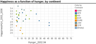
Scatterplots are extremely popular and useful graphical displays for examining the relationship between two numeric variables. They get even better when we add the use of color/hue and shape to include information on a third, categorical variable (or we can use size to include information on an additional numerical variable, to produce a "bubble chart"). For example, say we want to examine the relationship between the happiness of a nation and the percent of the population that live in poverty conditions -- using 2004 survey data from the World Database of Happiness. We can create a scatterplot with "Happiness" on the y-axis and "Hunger" on the x-axis. Each country will show up as a point on the scatterplot. Now, what if we want to compare across continents? We can use color! The plot below was generated using Spotfire. It took just a few seconds to generate it.

Now let's try creating a similar graph in Excel.
Creating a scatterplot in Excel is very easy. It is even not too hard to add size (by changing chart type from X Y (scatter) to Bubble chart). But adding color or shape, although possible, is very inconvenient and error-prone. Here's what you have to do (in Excel 2007, but it is similar in 2003):
  1. Sort your data by the categorical variable (so that all rows with the same category are adjacent, e.g., first all the Africa rows, then America rows, Asia rows, etc.).
  2. Choose only the rows that correspond to the first category (say, Africa). Create a scatterplot from these rows.
  3. Right-click on the chart and choose "Select Data Source". Or equivalently, choose in the Chart Tools Design> Data> Select data. Click "Add" to add another series. Enter the area on the spreadsheet that corresponds to the next category (America), separately choosing the x column and y column areas. Then keep adding the rest of the categories (continents) as additional series.

Besides being tedious, this procedure is quite prone to error, especially if you have many categories and/or many rows. It's a shame that Excel doesn't have a simpler way to generate color-coded scatterplots - almost every other software does.


Thursday, August 20, 2009

Data Exploration Celebration: The ENBIS 2009 Challenge

The European Network for Business and Industrial Statistics (ENBIS) has released the 2009 ENBIS Challenge. The challenge this time is to use an exploratory data analysis (EDA) tool to answer a bunch of questions regarding sales of laptop computers in London. The data on nearly 200,000 transactions include 3 files: sales data (for each computer sold, with time stamps and zipcode locations of customer and store), computer configuration information, and geographic information linking zipcodes to GIS coordinates. Participants are challenged to answer a set of 11 questions using EDA.

The challenge is sponsored by JMP (by SAS), who are obviously promoting the EDA strengths of JMP (fair enough), yet analysis can be done using any software.

What I love about this competition is that unlike other data-based competitions such as the KDD Cup, INFORMS, or the many forecasting competitiong (e.g. NN3), it focuses solely on exploratory analysis. No data mining, no statistical models. From my experience, the best analyses rely on a good investment of time and energy in data visualization. Some of today's data visualization tools are way beyond static boxplots and histograms. Interactive visualization software such as TIBCO Spotfire (and Tableau, which I haven't tried) allow many operations such as zooming, filtering, panning. They support multivariate exploration via the use of color, shape, panels, etc. and they include specialized visualization tools such as treemaps and parallel coordinate plots.

And finally, although the focus is on data exploration, the business context and larger questions are stated:

In the spirit of a "virtuous circle of learning", the insights gained from this analysis could then used to design an appropriate choice experiment for a consumer panel to determine which characteristics of the various configurations they actually value, thus helping determine product strategy and pricing policies that will maximise Acell's projected revenues in 2009. This latter aspect is not part of the challenge as such.

The Business Objective:
Determine product strategy and pricing policies that will maximise Acell's projected revenues in 2009.

Management's Charter:
Uncover any information in the available data that may be useful in meeting the business objective, and make specific recommendations to management that follow from this (85%). Also assess the relevance of the data provided, and suggest how Acell can make better use of data in 2010 to shape this aspect of their business strategy and operations (15%).

Saturday, June 13, 2009

Histograms in Excel

Histograms are very useful charts for displaying the distribution of a numerical measurement. The idea is to bucket the numerical measurement into intervals, and then to display the frequency (or percentage) of records in each interval.

Two ways to generate a histogram in Excel are:
  1. Create a pivot table, with the measurement of interest in the Column area, and Count of that measurement (or any measurement) in the Data area. Then, right-click the column area and "Group and Show Detail >  Group" will create the intervals. Now simply click the chart wizard to create the matching chart. You will still need to do some fixing to get a legal histogram (explanation below).
  2. Using the Data Analysis add-in (which is usually available with ordinary installation and only requires enabling it in the Tools>Add-ins menu): the Histogram function here will only create the frequency table (the name "Histogram" is misleading!). Then, you will need to create a bar chart that reads from this table, and fix it to create a legal histogram (explanation below).
Needed Fix: Histogram vs. Bar Chart
Background: Histograms and bar charts might appear similar, because in both cases the bar heights denote frequency (or percentage). However, they are different in a fundamental way: Bar charts are meant for displaying categorical measurements, while histograms are meant for displaying numerical measurements. This is reflected by the fact that in bar charts the x-axis conveys categories (e.g., "red", "blue", "green"), whereas in histograms the x-axis conveys the numerical intervals. Hence, in bar charts the order of the bars is unimportant and we can change the "red" bar with the "green" bar. In contrast, in histograms the interval order cannot be changed: the interval 20-30 can only be located between the interval 10-20 and the interval 30-40.

To convey this difference between bar charts and histograms, a major feature of a histogram is that there are no gaps between the bars (making the neighboring intervals "glue" to each other). The entire "shape" of the touching bars conveys important information, not only the single bars. Hence, the default chart that Excel creates using either of the two methods above will not be a legal and useful histogram unless you remove those gaps. To do that, double-click on any of the bars, and in the Options tab reduce the Gap to 0.

Method comparison:
The pivot-table method is much faster and yields a chart that is linked to the pivot table and is interactive. It also does not require the Data Analysis add-in. However,
there is a serious flaw with the pivot table method: if some of the intervals contain 0 records, then those intervals will be completely absent from the pivot table, which means that the chart will be missing "bars" of height zero for those intervals! The resulting histogram will therefore be wrong!


Thursday, April 23, 2009

Fragmented

In the process of planning the syllabus for my next PhD course on "Scientific Data-Collection", to be offered for the third time in Spring 2009, I have realized how fragmented the education of statisticians is, especially when considering the applied courses. The applied part of a typical degree in statistics will include a course in Design of Experiments, one on Surveys and Sampling, one on Computing with the latest statistical software (currently R), perhaps a Quality Control, and of course the usual Regression, Multivariate Analysis and other modeling courses. 

Because there is usually very little overlap between the courses (perhaps the terms "sigma" and "p-value" are repeated across them), or sometimes extreme overlap (we learned ANOVA both in a "Regression and ANOVA" course, and again in "Design of Experiments"). I initially conceptually compartmentalized courses into separate entities. Each had its own terminology and point of view. It took me a while to even get the difference between the "probability" part and the "statistics" part in the "Intro to probability and statistics" course. I can be cynical and attribute the mishmash to the diverse backgrounds of the faculty, but I suppose it is more due to "historical reasons".

After a while, to make better sense of my overall profession, I was able to cluster the courses into the broader "statistical models", "math and prob background", "computing", etc.
But truthfully, this too is very unsatisfactory. It's a very limited view of the "statistical purpose" of the tools, taking the phrases off the textbooks used in each subject.

For my Scientific Data-Collection course, where students come from wide range of business disciplines, I cover three main data collection methods (all within an Internet environment): Web collection (crawling, API, etc.), online surveys, and online/lab experiments. In a statistics curriculum you would never find such a combo. You won't even find a statistics textbook that covers all three topics. So why did we bind them? Because these are the main tools that researchers use today to gather data!

For each of the three topics we discuss how to design effective data collection schemes and tools. In additional to statistical considerations (guaranteeing that the collected data will be adequate for answering the reserach question of interest), and resource constraints (time, money, etc.), there are two additional aspects: ethical and technological. These are extremely important and are must-knows for any hands-on researcher.

Thinking of the non-statistical aspects of data collection has lead me to a broader and more conceptual view of the statistics profession. I like David Hand's definition of statistics as a technology (rather than a science). It means that we should think about our different methods as technologies within a context. Rather than thinking of our knowledge as a toolkit (with a hammer, screwdriver, and a few other tools), we should generalize across the different methods in terms of their use by non-statisticians. How and when do psychologists use surveys? experiments? regression models? T-tests? [Or are they compartmentalizing those according to the courses that they studied from Statistics faculty?] How are chemical engineers collecting, analyzing, and evaluating their data?

Ethical considerations are rarely discussed in statistics courses, although they usually are discussed in "research methods" grad courses in the social sciences. Yet, ethical considerations are all very closely related to the statistical design. Limitations on sample size can arise due to copyright law (web-crawling), due to safety of patients (clinical trials), or to non-response rates (surveys). Not to mention that every academic involved in human subjects research should be educated about Institutional Review Boards and the study approval process. Similarly, technological issues are closely related to sample size and the quality of the generated data. Servers that are down during a web crawl (or due to the web crawl!), email surveys that are not properly displayed on Firefox or caught by spam filters, or overly-sophisticated technological experiments are all issues that statistics students should also be educated about.

I propose to re-design the statistics curriculum around two coherent themes: "Modeling and Data Analysis Technologies", and "Data Collection / Study Design Technologies". An intro course should present these two different components, their role, and their links so that students will have context.

And, of course, the "Modeling and Data Analysis" theme should be clearly broken down into "explaining", "predicting", and "describing".

Saturday, April 18, 2009

Collecting online data (for research)

In the new era of large amounts of publicly available data, an issue that is sometimes overlooked is ethical data collection. Whereas for experimental studies involving humans we have clear guidelines and an organizational process for assessing and approving data collection (in the US, via the IRB), collecting observational data is much more ambiguous. For instance, if I want to collect data on 50,000 book titles on Amazon, including their ratings, reviews, and cover images - is it ethical to collect this information by web crawling? A first thought might be "why not? the information is there and I am not taking anything from anyone". However, there are hidden costs and risks here that must be considered. First, in the above example, the web crawler will be mimicking manual browsing, thereby accessing Amazon's server. This is one cost to Amazon. Secondly, Amazon posts this information for buyers for the purpose of generating revenue. When one's intention is not to actually purchase, then it is misuse of the public information. Finally, one must ask whether there is any risk to the data provider (for instance - maybe too heavy access can slow down the provider's server, thereby slowing down or even denying access to actual potential buyers).

When the goal of the data collection is research, then another factor to consider is the benefits of the research study to society, to scientific research or "general knowledge", and perhaps even to the company.

Good practice involves consideration of the costs, risks, and benefits to the data provider and accordingly designing your collection and letting the data provider know about your intention. Careful consideration of actual sample size is therefore still important even in this new environment. An interesting paper by Allen, Burk, and Davis (Academic Data Collection in Electronic Environments: Defining Acceptable Use of Internet Resources discusses these issues and offers guidelines for "acceptable use" of internet resources.

These days more and more companies (e.g., eBay and Amazon) are moving to "push" technology, where they make their data available for collection via API and RSS technologies. Obtaining data in this way avoids the ethical and legal considerations, but one is then limited to the data that the data source has chosen to provide. Moreover, the amount of data is usually limited. Hence, I believe that web crawling will continue to be used, but in combination with API and RSS the extent of crawling can be reduced.

Thursday, March 26, 2009

Principal Components Analysis vs. Factor Analysis

Here is an interesting example of how similar mechanics lead to two very different statistical tools. Principal Components Analysis (PCA) is a powerful method for data compression, in the sense of capturing the information contained in a large set of variables by a smaller set of linear combinations of those variables. As such, it is widely used in applications that require data compression, such as visualization of high-dimensional data and prediction.

Factor Analysis (FA), technically considered a close cousin of PCA, is popular in the social sciences, and is used for the purpose of discovering a small number of 'underlying factors' from a larger set of observable variables. Although PCA and FA are both based on orthogonal linear combinations of the original variables, they are very different conceptually: FA tries to relate the measured variables to underlying theoretical concepts, while PCA operates only at the measurement level. The former is useful for explaining; the latter for data reduction (and therefore prediction).

Richard Darlington, a Professor Emeritus of Psychology at Cornell, has a nice webpage describing the two. He tries to address the confusion between PCA and FA by first introducing FA and only then PCA, which is the opposite of what you'll find in textbooks. Darlington comments:
I have introduced principal component analysis (PCA) so late in this chapter primarily for pedagogical reasons. It solves a problem similar to the problem of common factor analysis, but different enough to lead to confusion. It is no accident that common factor analysis was invented by a scientist (differential psychologist Charles Spearman) while PCA was invented by a statistician. PCA states and then solves a well-defined statistical problem, and except for special cases always gives a unique solution with some very nice mathematical properties. One can even describe some very artificial practical problems for which PCA provides the exact solution. The difficulty comes in trying to relate PCA to real-life scientific problems; the match is simply not very good.
Machine learners are very familiar with PCA as well as other compression-type algorithms such as Singular Value Decomposition (the most heavily used compression technique in the Netflix Prize competition). Such compression methods are also used as alternatives to variable selection algorithms, such as forward selection and backward elimination. Rather than retain or remove "complete" variables, combinations of them are used.

I recently learned of Independent Components Analysis (ICA) from Scott Nestler, a former PhD student in our department. He used ICA in his dissertation on portfolio optimization. The idea is similar to PCA, except that the resulting components are not only uncorrelated, but actually independent.

Wednesday, March 25, 2009

Are experiments always better?

This continues my "To Explain or To Predict?" argument (in brief: statistical models aimed at causal explanation will not necessarily be good predictors). And now, I move to a very early stage in the study design: how should we collect data?

A well-known notion is that experiments are preferable to observational studies. The main difference between experimental studies and observational studies is an issue of control. In experiments, the researcher can deliberately choose "treatments" and control the assignment of subjects to the "treatments", and then can measure the outcome. Whereas in observational studies, the researcher can only observe the subjects and measure variables of interest.

An experimental setting is therefore considered "cleaner": you manipulate what you can, and randomize what you can't (like the famous saying Block what you can and randomize what you can’t). In his book Observational Studies, Paul Rosenbaum writes "Experiments are better than observational studies because there are fewer grounds for doubt." (p. 11).

Better for what purpose?

I claim that sometimes observational data are preferable. Why is that? well, it all depends on the goal. If the goal is to infer causality, then indeed an experimental setting wins hands down (if feasible, of course). However, what if the goal is to accurately predict some measure for new subjects? Say, to predict which statisticians will write blogs.

Because prediction does not rely on causal arguments but rather on associations (e.g., "statistician blog writers attend more international conferences"), the choice between an experimental and observational setting should be guided by additional considerations beyond the usual ethical, economic, and feasibility constraints. For instance, for prediction we care about the closeness of the study environment and the reality in which we will be predicting; we care about measurement quality and its availability at the time of prediction.

An experimental setting might be too clean compared to the reality in which prediction will take place, thereby eliminating the ability of a predictive model to capture authentic “noisy” behavior. Hence, if the “dirtier” observational context contains association-type information that benefits prediction, it might be preferable to an experiment.

There are additional benefits of observational data for building predictive models:
  • Predictive reality: Not only can the predictive model benefit from the "dirty" environment, but the assessment of how well the model performs (in terms of predictive accuracy) will be more realistic if tested in the "dirty" environment.
  • Effect magnitude: Even if an input is shown to cause an output in an experiment, the magnitude of the effect within the experiment might not generalize to the "dirtier" reality.
  • The unknown: even scientists don't know everything! predictive models can discover previously unknown relationships (associative or even causal). Hence, limiting ourselves to an experimental setting that is designed and limited to our knowledge, can keep our knowledge stagnant, and predictive accuracy low.
The Netflix prize competition is a good example: if the goal were to find the causal underpinnings of movie ratings by users, then an experiment may have been useful. But if the goal is to predict user ratings of movies, then observational data like those released to the public are perhaps better than an experiment.

Tuesday, March 10, 2009

What R-squared is (and is not)

R-squared (aka "coefficient of determination", or for short, R2) is a popular measure used in linear regression to assess the strength of the linear relationship between the inputs and the output. In a model with a single input, R2 is simply the squared correlation coefficient between the input and output.

If you examine a few textbooks in statistics or econometrics, you will find several definitions of R2. The most common definition is "the percent of variation in the output (Y) explained by the inputs (X's)". Another definition is "a measure of predictive power" (check out Wikepedia!). And finally, R2 is often called a goodness-of-fit measure. Try a quick Google search of "R-squared" and "goodness of fit". I even discovered this Journal of Economics article entitled An R-squared measure of goodness of fit for some common nonlinear regression models.

The first definition is correct, although it might sound overly complicated to a non-statistical ear. Nevertheless, it is correct.

As to R2 being a predictive measure, this is an unfortunately popular misconception. There are several problems with R2 that make it a poor predictive accuracy measure:
  1. R2 always increases as you add inputs, whether they contain useful information or not. This technical inflation in R2 is usually overcome by using an alternative metric (R2-adjusted), which penalized R2 for the number of inputs included.

  2. R2 is computed from a given sample of data that was used for fitting the linear regression model. Hence, it is "biased" towards those data and is therefore likely to be over-optimistic in measuring the predictive power of the model on new data. This is part of a larger issue related to performance evaluation metrics: the best way to assess the predictive power of a model is to test it on new data. To see more about this, check out my recent working paper "To Explain or To Predict?"
Finally, the popular labeling of R2 as a goodness-of-fit measure is, in fact, incorrect. This was pointed out to me by Prof. Jeff Simonoff from NYU. R2 does not measure how well the data fit the linear model but rather how strong the linear relationship is. Jeff calls it a strength-of-fit measure.

Here's a cool example (thanks Jeff!): If you simulate two columns of uncorrelated normal variables and then fit a regression to the resulting pairs (call them X and Y), you will get a very low R2 (practically zero). This indicates that there is no linear relationship between X and Y. However, the model being fitted is actually a regression of Y on X with a slope of zero. In that sense, the data do fit the zero-slope model very well, yet R2 tells us nothing of this good fit.

Monday, March 09, 2009

Start the Revolution

Variability is a key concept in statistics. The Greek letter Sigma has such importance, that it is probably associated more closely with statistics than with Greek. Yet, if you have a chance to examine the bookshelf of introductory statistics textbooks in a bookstore or the library you will notice that the variability between the zillions of textbooks, whether in engineering, business, or the social sciences, is nearly zero. And I am not only referring to price. I can close my eyes and place a bet on the topics that will show up in the table of contents of any textbook (summaries and graphs; basic probability; random variables; expected value and variance; conditional probability; the central limit theorem and sampling distributions; confidence intervals for the mean, proportion, two-groups, etc; hypothesis tests for one mean, comparing groups, etc.; linear regression) . I can also predict the order of those topics quite accurately, although there might be a tiny bit of diversity in terms of introducing regression up front and then returning to it at the end.

You may say: if it works, then why break it? Well, my answer is: no, it doesn't work. What is the goal of an introductory statistics course taken by non-statistics majors? Is it to familiarize them with buzzwords in statistics? If so, then maybe this textbook approach works. But in my eyes the goal is very different: give them a taste of how statistics can really be useful! Teach 2-3 major concepts that will stick in their minds; give them a coherent picture of when the statistics toolkit (or "technology", as David Hand calls it) can be useful.

I was recently asked by a company to develop for their managers a module on modeling input-output relationships. I chose to focus on using linear/logistic regression, with an emphasis on how it can be used for predicting new records or for explaining input-output relationships (in a different way, of course); on defining the analysis goal clearly; on the use of quantitative and qualitative inputs and output; on how to use standard errors to quantify sampling variability in the coefficients; on how to interpret the coefficients and relate them to the problem (for explanatory purposes); on how to trouble-shoot; on how to report results effectively. The reaction was "oh, we don't need all that, just teach them R-squares and p-values".

We've created monsters: the one-time students of statistics courses remember just buzzwords such as R-square and p-values, yet they have no real clue what those are and how limited they are in almost any sense.

I keep checking on the latest in statistics intro textbooks and see exercpts from the publishers. New books have this bell or that whistle (some new software, others nicer examples), but they almost always revolve around the same mishmash of topics with no clear big story to remember.

A few textbook have tried going the case-study avenue. One nice example is A Casebook for a First Course in Statistics and Data Analysis (by Chatterjee, Handcock, and Simonoff). It presents multiple "stories" with data, and how statistical methods are used to derive some insight. However, the authors suggest to use this book as an addendum to the ordinary teaching method: "The most effective way to use these cases is to study them concurrently with the statistical methodology being learned".

I've taught a "core" statistics course to audiences of engineers of different sorts and to MBAs. I had to work very hard to make the sequence of seemingly unrelated topics appear coherent, which in retrospect I do not think is possible in a single statistics course. Yes, you can show how cool and useful the concepts of expected value and variance are in the context of risk and portfolio management, or how the distribution of the mean is used effectively in control charts for monitoring industrial proceses, but then you must move on to the next chapter (usually sampling variance and the normal distribution), thereby erasing the point by piling on it totally different information. A first taste of statistics should be more pointed, more coherent, and more useful. Forget the details, focus on the big picture.

Bring on the revolution!

Saturday, January 10, 2009

Beer and ... crime

I often glimpse the local newspapers while visiting a foreign country (as long as it is in a language I can read). Yesterday, the Australian Herald Sun had the article "Drop in light beer sales blamed for surge in street violence".

The facts presented: "Light beer sales have fallen 15% in seven years, while street crime has soared 43%". More specifically: "Police statistics show street assaults rose from 6400 in 2000-01 to more than 9000 in 2007-08. At the same time, Victorians' thirst for light beer dried up."

The interpretation by health officials: "there was a definite connection between the move away from light beer and the rise in drunken violence."

The action: There is now a suggestion to drastically reduce tax on light beer to encourage people to switch back from full-strength beer.

I am far from being an expert on drinking problems or crime in Australia (although they are both very visible here in Melbourne), but let's look at the title of this article and the data-interpretation-action sequence more carefully. The title Drop in light beer sales blamed for surge in street violence implies that the drop in light beer sales is the cause of increase in violence. Obviously such a direct causal relationship cannot be true unless perhaps retailers of light beer have become frustrated and violent... So, the first causal argument (I suppose) is that the decline in drinking light beer reflects a move to full-strength alcohol, which in turn leads to more violence. If there indeed is a shift of this sort, then the decline in light beer sales is merely a proxy for violent behavior trends*.

The second causal hypothesis, implied by the proposed action, is that beer drinkers in Victoria will switch from full-strength to light beer if the latter is sufficiently cheap.

To establish such causal arguments I'd like to see a bit more research (which might already exist and not mentioned in the article):
  • Have people in Victoria indeed shifted from drinking light beer to full-strength beer? (perhaps via a survey or from transactional data at "bottle" stores) -- there might just be an overall decline in beer consumption, as well as an overall increase in violent behavior like in other places in the world
  • Has violence increased also by non beer drinkers? What about drugs, violent movies, shift of populations, economic trends, global violence levels?
  • If such a shift exists, what are its reasons? (e.g., better quality of full strength beer, social trends, price)
  • What segment of beer drinkers in Victoria becomes violent? (age, gender, employment, income, where they buy beer, etc.)
  • Is today's beer drinking population different from the population 7 years ago in some other important ways that relate to violence?
  • Has violence been treated differently over the years? (police presence, social norms, etc.)
  • Determine how price-sensitive today's drinkers-become-aggressors are.
Only after answering the above questions, and perhaps others, would I be comfortable with seeing a causal relationship between the price of light beer (compared to full-strength beer) and the levels of aggression.

And if beer drinking is indeed a cause of violence in Victoria, how about adopting behavioral and educational ideas from other countries like France? Or maybe alcohol is simply loosening the inhibitions on the growing aggressive 21st century society.

------------------------------------------
*Note: Even if light beer sales are merely a proxy for crime levels, they can be used for predictive purposes. For example, police stations can use light beer sale levels for staffing decision.