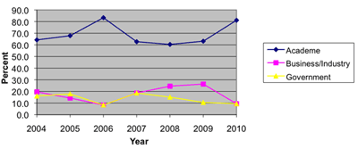
Now to the data-analytic reason for my post: The main article in the August 2010 issue of AMSTAT News (the ASA's magazine) on Fellow Award: Revisited (Again) presented an "update to previous articles about counts of fellow nominees and awardees." The article comprised of many tables and line charts. While charts are a great way to present a data-based story, the charts in this article were of low quality (see image below). Apparently, the authors used Excel 2003's defaults, which have poor graphic qualities and too much chart-junk: a dark grey background, horizontal gridlines, line color not very suitable for black-white printing (such as the print issue), a redundant combination of line color and marker shape, and redundant decimals on several of the plot y-axis labels.
As the flagship magazine of the ASA, I hope that the editors will scrutinize the graphics and data visualizations used in the articles, and perhaps offer authors access to a powerful data visualization software such as TIBCO Spotfire, Tableau, or SAS JMP. Major newspapers such as the New York Times and Washington Post now produce high-quality visualizations. Statistics magazines mustn't fall behind!
No comments:
Post a Comment