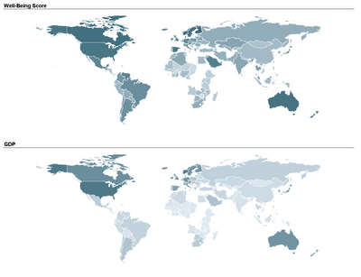
Two student teams in my Fall data mining class explored and displayed their data on map charts: one team compared economic, political, and well-being measures across different countries in the world. By linking a world map to their data, they could use color (hue and shading) to compare countries and geographical areas on those measures. Here's an example of two maps that they used. The top map uses shading to denote the average "well-being" score of a country (according to a 2004 Gallup poll), and the bottom map uses shading to denote the country's GDP. In both maps darker means higher.
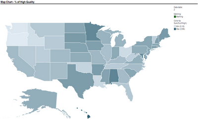
 Another team used a map to compare nursing homes in the US, in terms of quality of care scores. Their map below show the average quality of nursing home in each US State (darker means higher quality).
 These two sets of maps were created using TIBCO Spotfire. Following many requests, here is an explanation of how to create a map chart in Spotfire. Once you have your ordinary data file open, there are 3 steps to add the map component:
- Obtain the threesome of "shapefiles" needed to plot the map of interest: .shp file, .dbf file, and .shx file (see Wikipedia for an explanation of each)
- Open the shapefile in Spotfire (Open>New Visualization> Map Chart, then upload the shp file in Map Chart Properties> Data tab> Map data table)
- Link the map table to your data table using the Map Chart Properties> Data tab > Related data table for coloring (you will need a unique identifier linking your data table with the map table)
I thank Smith MBA students Dan Curtis, Erica Eisenhart, John Geraghty and Ben Meadema for their contributions to this post.
9 comments:
Hi Dr. Shmueli, we also have the world map with discrete colors, rather than the gradient. Would you like that one as well?
Hi Rob,
If you think that using different hues ("discrete colors") highlights other information then sure. If you can't post it yourself, send it to me and I will post it on your behalf.
And here is another source for shapefiles (thanks to Catherine Plaisant!):
http://www.lib.unc.edu/reference/gis/datafinder/index.html
Am still in search for shapefiles for London postcodes...
I actually used the US census shape files and Spotfire for my Integrated Business Plan class to show population growth projections and energy demand projections across the US. Here is a link to the final outputs: http://wellsperson.smugmug.com/photos/swfpopup.mg?AlbumID=12018622&AlbumKey=t4SbF
Wells - this is pretty cool! One suggestion is to replace the multi-color coding with a gradual scale. This is because you are conveying increasing values of a growing percentage.
By the way, what technology did you use to create the slideshow?
Professor Shmueli,
I worked with the gradual scale at first, but it was hard to tell the difference between the states (this was before I added the values below, I probably should have thought about going back after I added the values). For the slideshows, I exported each page from Spotfire into Powerpoint, then right clicked each image and saved them as pictures (.png files). I then uploaded them to my SmugMug account (photo publishing website) and posted a link to the slideshow.
Wells - you can control the amount of contrast between the different color shades by assigning different values to different shades in the Properties>Color area in Spotfire.
Thanks for the tip on posting the visualizations as a web-enabled slideshow!
This is really interesting and useful! But I search a little and they don't seem to have specific Asia maps. It is always good to know and maybe I will use it someday
Here's a terrific free resource that I discovered for shape files for many countries (including Asia!): http://www.diva-gis.org/gdata
Select a country, and then select "Administrative Areas".
Post a Comment