Thursday, December 23, 2010

No correlation -> no causation?

Applied Multiple Regression/Correlation Analysis for the Behavioral SciencesI found an interesting variation on the "correlation does not imply causation" mantra in the book Applied Multiple Regression/Correlation Analysis for the Behavioral Sciences by Cohen et al. (apparently one of the statistics bibles in behavioral sciences). The quote (p.7) looks like this:
Correlation does not prove causation; however, the absence of correlation implies the absence of the existence of a causal relationship
Let's let the first part rest in peace. At first glance, the second part seems logical: you find no correlation, then how can there be causation? However, after further pondering I reached the conclusion that this logic is flawed, and that one might observe no correlation when in fact there exists underlying causation. The reason is that causality is typically discussed at the conceptual level while correlation is computed at the measurable data level.

Where is Waldo?
Consider an example where causality is hypothesized at an unmeasurable conceptual level, such as "higher creativity leads to more satisfaction in life". Computing the correlation between "creativity" and "satisfaction" requires operationalizing these concepts into measurable variables, that is, identifying measurable variables that adequately represent these underlying concepts. For example, answers to survey questions regarding satisfaction in life might be used to operationalize "satisfaction", while a Rorschach test might be used to measure "creativity". This process of operationalization obviously does not lead to perfect measures, not to mention that data quality can be sufficiently low to produce no correlation even if there exists an underlying causal relationship.

In short, the absence of correlation can also imply that the underlying concepts are hard to measure, are inadequately measured, or that the quality of the measured data is too low (i.e., too noisy) for discovering a causal underlying relationship.

Monday, December 13, 2010

Discovering moderated relationship in the era of large samples

I am currently visiting the Indian School of Business (ISB) and enjoying their excellent library. As in my student days, I roam the bookshelves and discover books on topics that I know little, some, or a lot. Reading and leafing through a variety of books, especially across different disciplines, gives some serious points for thought.

As a statistician I have the urge to see how statistics is taught and used in other disciplines. I discovered an interesting book coming from the psychology literature by Herman Aguinas called Regression Analysis for Categorical Moderators. "Moderators" in statistician language is "interactions". However, when social scientists talk about moderated relationships or moderator variables, there is no symmetry between the two variables that create the interaction. For example if X1=education level, X2=Gender, and Y=Satisfaction at work, then an inclusion of the moderator X1*X2 would follow a direct hypothesis such as "education level affects satisfaction at work differently for women and for men."

Now to the interesting point: Aguinis stresses the scientific importance of discovering moderated relationships and opens the book with the quote:
"If we want to know how well we are doing in the biological, psychological, and social sciences, an index that will serve us well is how far we have advanced in our understanding of the moderator variables of our field."        --Hall & Rosenthal, 1991
Discovering moderators is important for understanding the bounds of generalizability as well as for leading to adequate policy recommendations. Yet, it turns out that "Moderator variables are difficult to detect even when the moderator test is the focal issue in a research study and a researcher has designed the study specifically with the moderator test in mind."

One main factor limiting the ability to detect moderated relationships (which tend to have small effects) is statistical power. Aguinas describes simulation studies showing this:
a small effect size was typically undetected when sample size was as large as 120, and ...unless a sample size of at least 120 was used, even ... medium and large moderating effects were, in general, also undetected.
This is bad news. But here is the good news: today, even researchers in the social sciences have access to much larger datasets! Clearly n=120 is in the past. Since this book has come out in 2004, have there been large-sample studies of moderated relationships in the social sciences?

I guess that's where searching electronic journals is the way to go...

Tuesday, November 16, 2010

November Analytics magazine on BI

click to read the latest issue
A bunch of interesting articles about business analytics and predictive analytics from a managerial point of view, in the November issue of INFORMS Analytics magazine.

Sunday, November 14, 2010

Data visualization in the media: Interesting video

A colleague who knows my fascination with data visualization pointed me to a recent interesting video created by Geoff McGhee on Journalism in the Age of Data. In this 8-part video, he interviews media people who create visualizations for their websites at the New York Times, Washington Post, CNBC, and more. It is interesting to see their view of why interactive visualization might be useful to their audience, and how it is linked to "good journalism".

Also interviewed are a few visualization interface developers (e.g., IBM's Many Eyes designers) as well as Infographics experts and participants at the major Inforgraphics conference in Pamplona, Spain. The line between beautiful visualizations (art) and effective ones is discussed in Part IV ("too sexy for its own good" - Gert Nielsen) - see also John Grimwade's article.


Journalism in the Age of Data from Geoff McGhee on Vimeo.

The videos can be downloaded as a series of 8 podcasts, for those with narrower bandwidth.

Wednesday, November 10, 2010

ASA's magazine: Excel's default charts

Being in Bhutan this year, I have requested the American Statistical Association (ASA) and INFORMS to mail the magazines that come with my membership to Bhutan. Although I can access the magazines online, I greatly enjoy receiving the issues by mail (even if a month late) and leafing through them leisurely. Not to mention the ability to share them with local colleagues who are seeing these magazines for the first time!

Now to the data-analytic reason for my post: The main article in the August 2010 issue of AMSTAT News (the ASA's magazine) on Fellow Award: Revisited (Again) presented an "update to previous articles about counts of fellow nominees and awardees." The article comprised of many tables and line charts. While charts are a great way to present a data-based story, the charts in this article were of low quality (see image below). Apparently, the authors used Excel 2003's defaults, which have poor graphic qualities and too much chart-junk: a dark grey background, horizontal gridlines, line color not very suitable for black-white printing (such as the print issue), a redundant combination of line color and marker shape, and redundant decimals on several of the plot y-axis labels.


As the flagship magazine of the ASA, I hope that the editors will scrutinize the graphics and data visualizations used in the articles, and perhaps offer authors access to a powerful data visualization software such as TIBCO Spotfire, Tableau, or SAS JMP. Major newspapers such as the New York Times and Washington Post now produce high-quality visualizations. Statistics magazines mustn't fall behind!

Thursday, September 30, 2010

Neat data mining competition; strange rule?

I received notice of an upcoming data mining competition by the Direct Marketing Association. The goal is to predict sales volume of magazines at 10,000 newsstands, using real data provided by CMP and Experian. The goal is officially stated as:
The winner will be the contestant who is able to best predict final store sales given the number of copies placed (draw) in each store. (Best will be defined as the root mean square error between the predicted and final sales.)
Among the usual competition rules about obtaining the data, evaluation criteria, etc. I found an odd rule stating: P.S. PARTICIPANTS MAY NOT INCLUDE ANY OTHER EXTERNAL VARIABLES FOR THE CHALLENGE. [caps are original]

It is surprising that contestants are not allowed to supplement the competition data with other, possibly, relevant information! In fact, "business intelligence" is often achieved by combining unexpected pieces of information. Clearly, the type of information that should be allowed is only information that is available at the time of prediction. For instance, although weather is likely to affect sales, it is a coincident indicator and requires forecasting in order to include as a predictor. Hence, the weather at the time of sale should not be used, but perhaps the weather forecast can (the time lag between the time of prediction and time of forecast must, of course, be practical).

For details and signing up, see http://www.hearstchallenge.com.

Saturday, September 04, 2010

Forecasting stock prices? The new INFORMS competition

Image from www.lumaxart.com
The 2010 INFORMS Data Mining Contest is underway. This time the goal is to predict 5-minute stock prices. That's right - forecasting stock prices! In my view, the meta-contest is going to be the most interesting part. By meta-contest I mean looking beyond the winning result (what method, what prediction accuracy)  and examining the distribution of prediction accuracies across all the contestants, how the winner is chosen, and most importantly, how the winning result will be interpreted in terms of concluding about the predictability level of stocks.

Why is a stock prediction competition interesting? Because according to the Efficient Market Hypothesis (EMH), stocks and other traded assets are random walks (no autocorrelation between consecutive price jumps). In other words, they are unpredictable. Even if there is a low level of autocorrelation, then the bid-offer spread and transaction costs make stock predictions worthless. I've been fascinated with how quickly and drastically the Wikipedia page on the Efficient Market Hypothesis has changed in the last years (see the page history). The proponents of the EMH seem to be competing with its opponents in revising the page. As of today, the opponents are ahead in terms of editing the page -- perhaps the recent crisis is giving them an advantage.

The contest's evaluation page explains that the goal is to forecast whether the stock price will increase or decrease in the next time period. Then, entries will be evaluated in terms of the average AUC (area under the ROC curve). Defining the problem as a binary prediction problem and using the AUC to evaluate the results adds an additional challenge: the average AUC has various flaws in terms of measuring predictive accuracy. In a recent article in the journal Machine Learning, the well-known statistician Prof David Hand shows that in addition to other deficiencies "...the AUC uses different misclassification cost distributions for different classifiers."

In any case, among the many participants in the competition there is going to be a winner. And that winner will have the highest prediction accuracy for that stock, at least in the sense of average AUC. No uncertainty about that. But will that mean that the winning method is the magic bullet for traders? Most likely not. Or, at least, I would not be convinced until I saw the method consistently outperform a random walk across a large number of stocks and different time periods. For one, I would want to see the distribution of results of the entire set of participants and compare it to a naive classifier to evaluate how "lucky" the winner was.

The competition page reads: The results of this contest could have a big impact on the finance industry. I find that quite scary, given the limited scope of the data, the evaluation metric, and the focus on the top results rather than the entire distribution.
Tuesday, August 03, 2010

The PCA Debate

Recently a posting on the Research Methods Linked-In group asked what is Principal Components Analysis (PCA) in laymen terms and what is it useful for. The answers clearly reflected the two "camps": social science researchers and data miners. For data miners PCA is a popular and useful data reduction method for reducing the dimension of dataset with many variables. For social scientists PCA is a type of factor analysis without a rotation step. The last sentence might sound cryptic to a non-social-scientist, so a brief explanation is in place: The goal of rotation is to simplify and clarify the interpretation of the principal components relative to each of the original variables. This is achieved by optimizing some criterion (see http://en.wikipedia.org/wiki/Factor_analysis#Rotation_methods for details).

Now here comes the explain vs. predict divide:
PCA and factor analysis often produce practically similar results in terms of "rearranging" the total variance of the data. Hence, PCA is by far more common in data mining compared to Factor Analysis. In contrast, PCA is considered by social scientists to be inferior to Factor Analysis because their goal is to uncover underlying theoretical constructs. Costello & Osborne (in the 2005 issue of the online journal Practical Assessment, Research& Evaluation) give an overview of PCA and factor analysis, discuss the debate between the two, and summarize:
We suggest that factor analysis is preferable to principal components analysis. Components analysis is only a data reduction method. It became common
decades ago when computers were slow and expensive to use; it was a quicker, cheaper alternative to factor analysis... However, researchers rarely collect and analyze data without an a priori idea about how the variables are related (Floyd & Widaman, 1995). The aim of factor analysis is to reveal any latent variables that cause the manifest variables to covary.

Moreover, the choice of rotation method can lead to either correlated or uncorrelated factors. While data miners would tend to opt for uncorrelated factors (and therefore would stick to the uncorrelated principal components with no rotation at all), social scientists often choose a rotation that leads to correlated factors! Why? Costello & Osborne explain: "In the social sciences we generally expect some correlation among factors, since behavior is rarely partitioned into neatly packaged units that function independently of one another."

At the end of the day, it comes down to the different places that causal-explanatory scientist and data miners take on the data-theory continuum. In the social sciences, researchers assume an underlying causal theory before considering any data or analysis. The "manifest world" is only useful for uncovering the "latent world". Hence, data and analysis methods are viewed only through the lens of theory. In contrast, in data mining the focus is at the data level, or the "manifest world", because often there is no underlying theory, or because the goal is to predict new (manifest) data or to capture an association at the measurable data level.


Thursday, May 20, 2010

Google's new prediction API

I just learned of the new Prediction API by Google -- in brief, you upload a training set with up to 1 million records and let Google's engine build an algorithm trained on the data. Then, upload a new dataset for prediction, and Google will apply the learned algorithm to score those data.

On the user's side, this is a total blackbox since you have no idea what algorithms are used and which is chosen (probably an ensemble). The predictions can therefore be used for utility (accurate predictions). For researchers, this is a great tool for getting a predictive accuracy benchmark. I foresee future data mining students uploading their data to the Google Prediction API to see how well they could potentially do by mining the data themselves!

From Google's perspective this API presents a terrific opportunity to improve their own algorithms on a wide set of data.

Someone mentioned that there are interesting bits in the FAQ. I like their answer to how accurate are the predictions? which is "more data and cleaner data always triumphs over clever algorithms".

Right now the service is free (if you get an invitation), but it looks like it will eventually be a paid service. Hopefully they will have an "academic version"!

Wednesday, May 12, 2010

SAS On Demand Take 3: Success!

I am following up on two earlier posts regarding using SAS On Demand for Academics. The version of EM has been upgraded to 6.1, which means that I am now able to upload and reach non-SAS files on the SAS Server - hurray!

The process is quite cumbersome, and I do thank my SAS programming memory from a decade ago. Here's a description for those instructors who want to check it out (it took me quite a while to piece all the different parts and figure out the right code):
  1. Find the directory path for your course on the SAS server. Login into SODA (https://support.sas.com/ctx3/sodareg/user.html). Near the appropriate course that you registered, click on the "info" link. Scroll down to the line starting with "filename sample" and you'll find the directory path.
  2. Upload the file of interest to the SAS server via FTP. Note that you can upload txt and csv files but not xls or xlsx files. The hostname is sascloudftp.sas.com . You will also need your username and password. Upload your file to the path that you found in #1.
  3. To read the file in SAS SODA EM, start a new project. When you click on its name (top left), you should be able to see "Project Start Code" in the left side-bar. Click on the ...
  4. Now enter the SAS code to run for this project. The following code will allow you to access your data. The trick is both to read the file and to put it into a SAS Library where you will be able to reach it for modeling. Let's assume that you uploaded the file sample.csv:
libname mylibrary '/courses/.../'; THIS IS YOUR PATH
    filename myfile '/courses/.../sample.csv'; USE THE SAME PATH
      data mydata;
        infile myfile DLM='2C0D'x firstobs=2 missover;
          input x1 x2 x3 ...;
            run;
              data mylibrary.mydata;
                set mydata;
                  run;
                  The options in the infile line will make sure that a CSV file is read correctly (commas and the carriage return at the end of the line! tricky!)

                  You can replace all the names that start with "my" with your favorite names.

                  Note that only instructors can upload data to the SAS server, not students. Also, if you plan to share data with your students, you might want to set them as read only.

                  5. The last step is to create a new datasource. Choose SAS Table and find the new library that you created (called "mylibrary"). Double-click on it to see the file ("myfile") and choose it. You can now drag the new datasource to the diagram.

                  Saturday, May 08, 2010

                  Short data mining videos

                  I just discovered a short set of videos (currently 35) on different data mining methods on the StatSoft website. This accompanies their neat free online book (I admit, I did end up buying the print copy). The videos show up at the top of various data mining topics in the online book. You can also subscribe to the video series.

                  Thursday, April 08, 2010

                  Mathematics, statistics, and machine learning

                  Today's Wall Street Journal featured an article called New Hiring Formula Values Math Pros, talking about how Bay area companies
                  "are in hot pursuit of a particular kind of employee: those with experience in statistics and other data-manipulation techniques."
                  Let's take a look at a few more quotes from the article:
                  "Being a math geek has never been cooler"
                  "[companies] need more workers with stronger backgrounds in statistics and a related field called machine learning, which involves writing algorithms that get smarter over time by looking for patterns in large data sets"
                  This article, like many others, is confusing very different fields of expertise. Try the following on any statistician or data miner in your vicinity:

                  math = statistics = data manipulation = machine learning

                  Most likely, you were showered with an angry explanation of how these are different. One of the comments on the WSJ article was "I wish there wasn't such a tendency to think that "machine learning" and "applied statistics" are the same thing. There are plenty of other ways to apply statistics than to use the techniques of machine learning."

                  Although there are many views on the subject, here's my take on the basic differences:

                  1. Mathematics is the farthest from the other 3. Although math is used as one of the basics for these fields (as in physics), its goal is very different from the data-driven goals of statistics and machine learning. Most mathematicians never touch real data in their lives. I will make one caveat: While I'm talking about applied statistics, some theoretical statisticians might be close to mathematicians. I once sat on a PhD committee with theoretical statisticians. I suggested to the student to justify the need for the complicated methodological development that she worked on, when a simple solution could do a decent job. Her advisor stormed in saying "here we like to prove theorems!"
                  2. Applied statistics is a sophisticated set of technologies to quantify uncertainty from data in real life situations for the purpose of theory testing, description, or prediction. Applied statisticians start from a real problem with real data, and apply (and develop) methods for solving the problem.
                  3. Data Manipulation -- this is a very strange term. Statisticians might use this term to refer to initial data cleaning, or other initial data operations such as taking transformations or removing outliers. Data miners might use this term to describe the creation of new variables from existing ones, or converting some variables into new format. I have no idea what a mathematician would think of this term ("what do you mean by data?")
                  4. Machine learning, also often termed data mining, is a sophisticated set of technologies that are usually aimed at predicting new data, by automatically learning patterns from existing data. Lots of existing data. The field uses a variety of algorithms and methods from statistics and artificial intelligence. Although statistical methods (such as linear and logistic regression) are commonly used in machine learning, they are most often used in a purely predictive way. Many of the artificial intelligence-based algorithms are "black-box" in that they provide excellent results (e.g., accurate predictions) but do not rely on formal causal models and do not shed direct light on the causal relationship between the inputs and the outputs.
                  Sometimes computer scientists use the term "data mining" to refer to data warehousing and data querying. That is completely different from #4.

                  And finally, there is one last "equivalence" that irritates me: data mining = operations research (OR). When OR colleagues use the term "data mining" they usually are talking about an optimization problem. They do not typically use machine learning or statistical methods. Or, if they do mean "data mining" as in #4 above, then it has nothing to do with OR. For example, see Professor Michael Trick's Operations Research Blog entry Data Mining, Operations Research, and Predicting Murder. How is this related to OR?

                  Tuesday, March 16, 2010

                  Advancing science vs. compromising privacy

                  Data mining often brings up the association of malicious organizations that violate individuals' privacy. Three days ago, this tension was brought up a notch (at least in my eyes): Netflix decided to cancel the second round of the famous Netflix Prize. The reason is apparent in the New York Times article "Netflix Cancels Contest After Concerns Are Raised About Privacy". Researchers from the University of Texas have shown that the data disclosed by Netflix in the first contest could be used to identify users. One woman sued Netflix. The Federal Trade Commission got involved, and the rest is history.

                  What's different about this case is that the main benefactor of the data made public by Netflix is the scientific data mining community. The Netflix Prize competition lead to multiple worthy goals including algorithmic development, insights about existing methods, cross-disciplinary collaborations (in fact, the winning team was a collaboration between computer scientists and statisticians), collaborations between research groups (many competing teams joined forces to create more accurate ensemble predictions). There was actual excitement among data mining researchers! Canceling the sequel is perceived by many as an obstacle to innovation. Just read the comments on the cancellation posting on Netflix's blog.

                  After the first feeling of disappointment and some griping, I started to "think positively": What are ways that would allow companies such as Netflix to share their data publicly? One can think of simple technical solutions such as an "opt out" (or "opt in") when you rate movies on Netflix that would tell Netflix whether they can use your data in the contest. But clearly there are issues there such as bias and maybe even legal and technical issues.

                  But what about all that research on advanced data disclosure? Are there not ways to anonymize the data to a reasonable level of comfort? Many organizations (including the US Census Bureau) disclose data to the public while protecting privacy. My sense is that current data disclosure policies are aimed at disclosing data that will allow statistical inference, and hence the disclosed data are aggregated at some level, or else only relevant summary statistics are disclosed (for example, see A Data Disclosure Policy for Count Data Based on the COM-Poisson Distribution). Such data would not be useful for a predictive task where the algorithm should predict individual responses. Another popular masking method is data perturbation, where some noise is added to each data point in order to mask its actual value and avoid identification. The noise addition is intended not to affect statistical inference, but it's a good question how perturbation affects individual-level prediction.

                  It looks like the data mining community needs to come up with some data disclosure policies that support predictive analytics.

                  Tuesday, February 23, 2010

                  Online data collection

                  Online data are a huge resources for research as well as in practice. Although it is often tempting to "scrape everything" using technologies like web-crawling, it is extremely important to keep the goal of the analysis in mind. Are you trying to build a predictive model? A descriptive model? How will the model be used? Deployed to new records? etc.

                  Dean Tau from Co-soft recently posted an interesting and useful comment in the Linked-in group Data Mining, Statistics, and Data Visualization. With his permission, I am reproducing his post:

                  What you need to do before online data collection?

                  Data colllection is collecting useful intelligence for making decisions such as product price determination. Nowadays, available on websites, directories, B2B/B2C platforms, e-books, e-newspaper, yellow page, official data, accessible databases, vast and updated information online encourages more people to collect data from the Internet. Before data mining, you still need to be well prepared, as the ancient Chinese saying “Preparedness ensures success, unpreparedness spells failure.”

                  1. Why do you want to collect intelligence or what's your objective? What will you do with this intelligence after collection? Making a description of your project can help the data mining team have a better understanding of your aim. Taking an example, an objective can be I want to collect enough intelligence to determine a competitive price for my product.
                  2. What type of information you need to collect to support your final analysis / decision? Such as, if you want to collect the prices of similar product, product specification are necessary to collect for comparison of the same one. The external factors like coupon, gifts or tax also need to be considered for accuracy.
                  3. Where? General searching using keywords or gathering data from specific resources or database depends on project nature. The information from e-commerce websites would be a great avenue for price gathering and product specification.
                  4. Who? Will you collect the data by using the resources of your own or outside resources? Outsourcing of online research work to lower wages countries with the accessibility of internet capabilities and vast English educated personnel like China would be an option for cutting cost. The people who are going to do the work need training and necessary resources on that.
                  5. How? Always remember your purpose of collecting data to improve the collection process. The methodology and process need to be defined to ensure accurate and reliable data. Decisions making on wrong data would result in serious problems.
                  I've summarized 5 tips from myself and my clients' experiences, hopefully to provide some insights for you. If you have any opinion or experience in online data gathering or outsourcing, please share with us or contact me directly.

                  Friday, February 12, 2010

                  Over-fitting analogies

                  To explain the danger of model over-fitting in prediction to data mining newcomers, I often use the following analogy:
                  Say you are at the tailor's, who will be sewing an expensive suit (or dress) for you. The tailor takes your measurements and asks whether you'd like the suit to fit you exactly, or whether there should be some "wiggle room". What would you choose?
                  The answer is, "it depends how you plan to use the suit". If you are getting married in a few days, then probably a close fit is desirable. In contrast, if you plan to wear the suit to work throughout the next few years, you'd most likely want some "wiggle room"... The latter case is similar to prediction, where you want to make sure to accommodate new records (your body's measurements during the next few years) that are not exactly identical to the current data. Hence, you want to avoid over-fitting. The wedding scenario is similar to models built for causal explanation, where you do want the model to fit the data well (back to the explanation vs. prediction distinction).

                  I just found some nice terminology, by Bruce Ratner (GenIQ.net), explaining the idea of over-fitting:
                  A model is built to represent a training data... not to reproduce a training data. [Otherwise], a visitor from the validation data will not feel at home. The visitor encounters an uncomfortable fit in the model because s/he probabilistically does not look like a typical data-point from the training data. Thus, the misfit visitor takes a poor prediction

                  Wednesday, January 27, 2010

                  Drag-and-drop data mining software for the classroom

                  The drag-and-drop (D&D) concept in data mining tools is very neat. You "drag" icons (aka "nodes") that do different operations, and "connect" them to create a data mining process. This is also called "graphical programming". What I especially like about it is that it keeps the big picture in your mind rather than getting blinded by analysis details. The end product is also much easier to present and document.

                  There has been quite a bonanza lately with a few of the major D&D data mining software tools. Clementine (by SPSS - now IBM) is now called "IBM SPSS Modeler". Insightful Miner (by Insightful - now TIBCO) is now TIBCO Spotfire Miner. SAS Enterprise Miner remains SAS EM. And STATISTICA Data Miner by StatSoft also remains in the same hands.

                  There's a good comparison of these four tools (and two more non-d&d, menu driven tools: KXEN and XLMiner) on InformationManagement.com. The 2006 article by Nisbet compares performance, pricing, and more.

                  Let me look at the choice of a D&D package from the perspective of a professor teaching a data mining course in a business school. My own considerations are: (1) easy and fast to learn, (2) easy for my students to access, (3) cheap enough for our school to purchase, and (4) reasonably priced for students after they graduate. It's also nice to have good support (when things break down or when you just can't figure something out). And some instructors also like additional teaching materials.

                  I've had the longest experience with SAS EM, but it has been a struggle. At first we had individual student licenses, where each student had to download the software from a set of CDs that I had to circulate between them. The size of the software choked too many computers. So we moved to the server version (that allows students to use the software through our portal), but that has been excruciatingly slow. The server version is also quite expensive to the school. The potential solution was to move to using the "SAS on demand" product, where the software is accessed online and sits on the SAS servers. SAS offers this through the SAS on demand for Academics (SODA) program and it is faster. However, as I ranted in another post, SODA currently can only load SAS datasets. And finally, SAS EM is extremely expensive outside of academia. The likelihood that my students would have access to it in their post-graduation job was therefore low.

                  I recently discovered Spotfire Miner (by TIBCO) and played around with it. Very fast and easy to learn, runs fast, and happily accepts a wide range of data file types. Cost for industry is currently $349/month. For use in the classroom it is free to both instructor and students! (as part of TIBCO's University Program).

                  I can't say much about IBM SPSS Modeler (previously known as Clementine) or StatSoft's STATISTICA Data Miner, except that after looking thoroughly through their websites I couldn't find any mention of pricing for academia or for industry. And I usually don't like the "request a quote" which tends to leave my mailbox full of promotional materials forever (probably the result of a data mining algorithm used for direct marketing!). Is the academic version identical to the full-blown version? is it a standalone installation or do you install it on a server?

                  For instructors who like extra materials: SAS offers a wealth of data mining teaching materials (you must contact them to receive the materials). StatSoft has a nice series of YouTube videos on different data mining topics and a brief PDF tutorial on data mining (they also have the awesome free Electronic Statistics Textbook which is a bit like an encyclopedia). I don't know of data mining teaching materials for the other packages (and couldn't find any on their websites).

                  It would be great to hear from other instructors and MBA students about their classroom (and post-graduation) experience with D&D software.

                  Wednesday, January 06, 2010

                  Creating map charts

                  With the growing amount of available geographical data, it is useful to be able to visualize one's data on top of a map. Visualizing numeric and/or categorical information on top of a map is called a map chart.

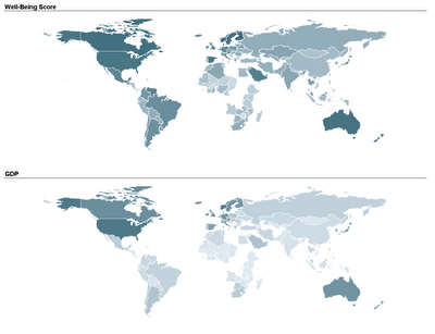
                  Two student teams in my Fall data mining class explored and displayed their data on map charts: one team compared economic, political, and well-being measures across different countries in the world. By linking a world map to their data, they could use color (hue and shading) to compare countries and geographical areas on those measures. Here's an example of two maps that they used. The top map uses shading to denote the average "well-being" score of a country (according to a 2004 Gallup poll), and the bottom map uses shading to denote the country's GDP. In both maps darker means higher.

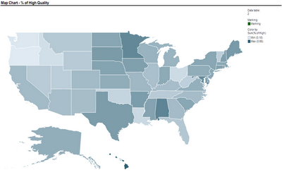
                  Another team used a map to compare nursing homes in the US, in terms of quality of care scores. Their map below show the average quality of nursing home in each US State (darker means higher quality).These two sets of maps were created using TIBCO Spotfire. Following many requests, here is an explanation of how to create a map chart in Spotfire. Once you have your ordinary data file open, there are 3 steps to add the map component:
                  1. Obtain the threesome of "shapefiles" needed to plot the map of interest: .shp file, .dbf file, and .shx file (see Wikipedia for an explanation of each)
                  2. Open the shapefile in Spotfire (Open>New Visualization> Map Chart, then upload the shp file in Map Chart Properties> Data tab> Map data table)
                  3. Link the map table to your data table using the Map Chart Properties> Data tab > Related data table for coloring (you will need a unique identifier linking your data table with the map table)
                  The tricky part is obtaining shapefiles. One good source with free files is Blue Marble Geographics (thanks to Dan Curtis for this tip!). For US state and county data, shapefiles can be obtained from the US Census Bureau website (thanks to Ben Meadema for this one!) I'm still in search for more sources (for Europe and Asia, for instance).

                  I thank Smith MBA students Dan Curtis, Erica Eisenhart, John Geraghty and Ben Meadema for their contributions to this post.