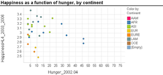
Scatterplots are extremely popular and useful graphical displays for examining the relationship between two numeric variables. They get even better when we add the use of color/hue and shape to include information on a third, categorical variable (or we can use size to include information on an additional numerical variable, to produce a "bubble chart"). For example, say we want to examine the relationship between the happiness of a nation and the percent of the population that live in poverty conditions -- using 2004 survey data from the World Database of Happiness. We can create a scatterplot with "Happiness" on the y-axis and "Hunger" on the x-axis. Each country will show up as a point on the scatterplot. Now, what if we want to compare across continents? We can use color! The plot below was generated using Spotfire. It took just a few seconds to generate it.
 Now let's try creating a similar graph in Excel.
Creating a scatterplot in Excel is very easy. It is even not too hard to add size (by changing chart type from X Y (scatter) to Bubble chart). But adding color or shape, although possible, is very inconvenient and error-prone. Here's what you have to do (in Excel 2007, but it is similar in 2003):
Besides being tedious, this procedure is quite prone to error, especially if you have many categories and/or many rows. It's a shame that Excel doesn't have a simpler way to generate color-coded scatterplots - almost every other software does.
 Now let's try creating a similar graph in Excel.
Creating a scatterplot in Excel is very easy. It is even not too hard to add size (by changing chart type from X Y (scatter) to Bubble chart). But adding color or shape, although possible, is very inconvenient and error-prone. Here's what you have to do (in Excel 2007, but it is similar in 2003):
- Sort your data by the categorical variable (so that all rows with the same category are adjacent, e.g., first all the Africa rows, then America rows, Asia rows, etc.).
- Choose only the rows that correspond to the first category (say, Africa). Create a scatterplot from these rows.
- Right-click on the chart and choose "Select Data Source". Or equivalently, choose in the Chart Tools Design> Data> Select data. Click "Add" to add another series. Enter the area on the spreadsheet that corresponds to the next category (America), separately choosing the x column and y column areas. Then keep adding the rest of the categories (continents) as additional series.
Besides being tedious, this procedure is quite prone to error, especially if you have many categories and/or many rows. It's a shame that Excel doesn't have a simpler way to generate color-coded scatterplots - almost every other software does.
15 comments:
You could Split Data Range into Multiple Chart Series without VBA or use VBA to Split Data Range into Multiple Chart Series.
Thanks Jon. That's a good solution for the VBA-literate bunch. Still, since color-coded scatterplots are so useful in almost any context, it would be very nice to be able to generate them within Excel without the need of VBA.
Actually, the first article shows how to use formulas without VBA, but it does require extra effort to set up.
Maybe I'll try to put together a self-contained add-in that people could run to do this.
Jon - it would be terrific if you created a color-coding add-in for Excel scatterplots! I'd easily add it to my toolkit for "bare bones Excel" alongside your boxplot add-in.
I used to be a big fan of Excel in creating color coded scatterplot. After using Spotfire,I get addicted to it due to its convenience and powerful functions. I also like the function of jittering, it helps to separate the overlapping data. Really wish the spotfire free trial won't be expire after 1 year.
I agreed with this article. Spotfire is such a powerful tool for visualization. Compared with Spotfire, Excel seems to be less intuitive and less user-friendly. Although it takes some time to get used to Spotfire, once you know how to use it, it's terrific!!! I am glad Professor asked us to use this tool in class. Now I wonder how much it costs to use Spotfire after the evaluation period. :P
I totally agree to the above comment, I am glad the professor made us use it. In fact when the prof. said in the first class that Spot Fire is addictive I didn’t believe her, but what the Prof. said is absolutely true. It is very addictive. I checked the price of Spot fire and its pricing model is different. You have to pay a monthly/annual fee instead of buying the software outright and the monthly subscription starts at $199. I also checked Tableau and while that can be bought outright, the desktop version costs $999.
I have never tried color coded scatter plot in Excel...I believe you... that must be a nightmare.
Now as everyone else is saying, you have made us addicted to Spotfire. Initially, I had lot of trouble using it from the Smith Portal, than half of the time I forgot the weird username and password provided by TIBCO. But now I believe Spotfire is very robust tool and comes very handy in the most important part of data mining i.e. data exploration and visualization.
Here's a response from Mark Lorion at TIBCO Spotfire (mlorion@tibco.com):
Spotfire recently introduced a $79/month version of the software to make it easier to get started with desktop installations. Some of the higher-end functionality has been removed, but it should serve most of what I believe your students are using should be there.
Hopefully that is good news for you and them!
On a related note, we also recently introduced a brand new Community on our site, which exposes tons of training, helpful hints, tips and tricks of the week, and user-to-user collaboration. You should find lots of helpful info here for free that we used to reserve for paid training.
Looking at the comparison chart between the $79/month Spotfire Express and the version that we used in class, a lot of stuff is still there. Here are some great features that are lost (ouch!):
Treemaps, boxplots, parallel coordinate plots, and the ability to merge datasets. Some of the summaries (like median and standard deviation) are also stripped out of the Express version.
Galit -
Could you change the date/time format for the posts and comments? Just knowing the time something was posted is irrelevant if you also don't know the date.
Thanks Jon - I just fixed it.
I personally think it would be great if creating color graphs in excel was more user friendly. I use excel in my daily work to create models, do quick calcs and to create graphs. With the graph portion containing some glaring limitations. Spotfire is much more robust but I've found it to be somewhat cumbersome at times as well.
I was hesitant to switch from Excel to Spotfire to create graphs initially because I was so used to working with Excel. However, after my first time using Spotfire, I find it so much more convenient and efficient compared to Excel. I definitely like the color coding option that is so much easier to do in Spotfire than Excel.
One issue we ran into while creating the PPT presentation was transfering SpotFire graph into the PowerPoint. After adjusting the image size, the tiny labels were still difficult to read. In addition, it's more difficult modifying the differet aspects of the graph to make it more "presentation friendly." Maybe I am just not that well-versed with the software but I think Excel graphs (the 2007 ones look pretty amazing) are more friendly/compatible with PowerPoint.
Post a Comment